
BrandZap
George Little
Case Study
Industry
Education & Student Support Software
Core Technology
Figma, Webflow
Engagement
Website Product Storytelling
Focus
Student-Centered Visuals & Motion Direction
August Schools is a software-as-a-service platform for schools. It brings different parts of student support into a platform accessible to a wide range of educitational staff. Its website needed to explain that breadth to people with different responsibilities, from school leadership to the teams providing day-to-day care; they need a clear sense of how the pieces relate before exploring individual features.
BrandZap worked with the August Schools team to sharpen their website's story around the student while maintiain and strategically improving their brand. The design direction was cenereated around the students and interactions of staff as found throughout their plaftorm: student records with attendance, support encounters, wellbeing information, among many other features. The goal was to give a broad, largely-administrative platform a more human and concrete story.
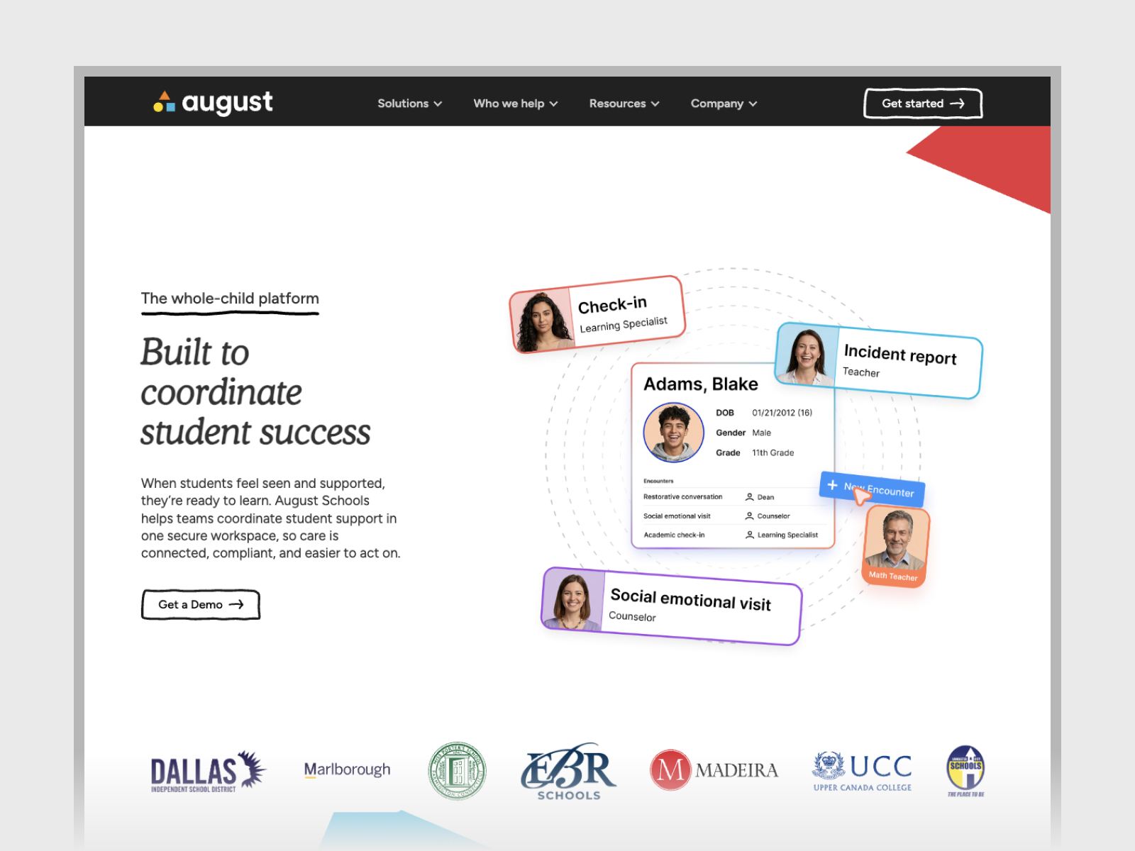
Platforms that bring many useful capabilities together can be difficult to explain in a single hero graphic. A wide collection of screens may communicate a range of capabilities while leaving visitors to work out the solutions themselves. August needed a story that made proactive student support understandable, without requiring a full product demonstration — enough to get a sense of whats offered at a glance.
An added challenge is photography. In order to create a relatable story, we needed to use representations of students, teachers and staff in a way that's relatable, but without showcasing real kids or adults. Because many of the features and abilities of August Schools rely on recording and referencing real world interactions, it was important to showcase examples of them alongisde the product.
We started with the homepage. Our first idea was to show the “village” of people around a student. That made sense for August Schools. A teacher, a counselor, and a school nurse might all work with the same student on the same day, and each might see a different part of what’s going on.
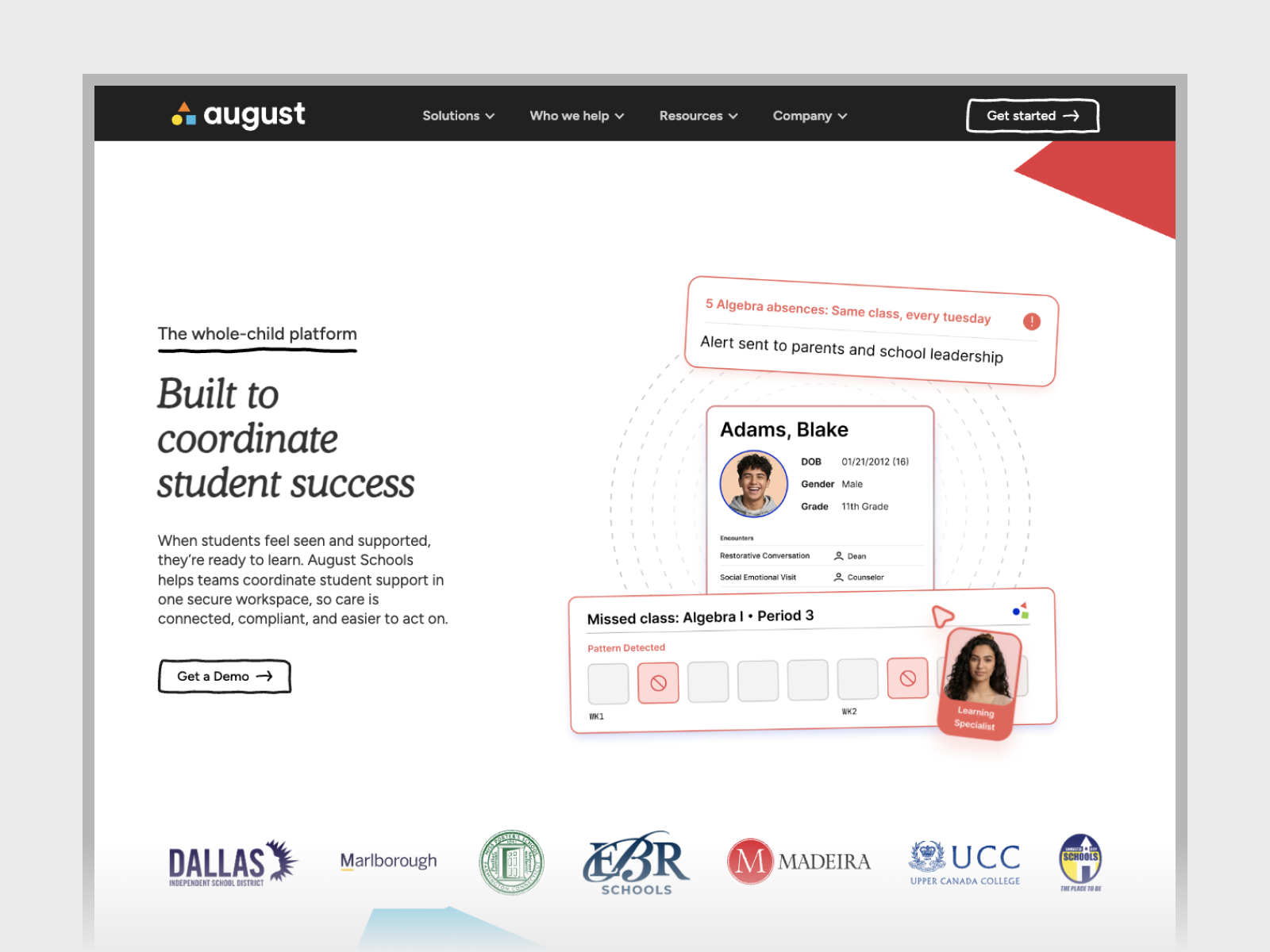
As we talked through the graphics with the August team, we kept coming back to a more specific moment. What happens when someone notices that a student has been missing class? An attendance alert gave us somewhere to start. From there, we could follow one student and show how the adults around them might use August to understand more about what was happening.
That gave us an approach we could carry through the rest of the website. For each product graphic, we started with someone doing their job at a school. What just happened? What would they want to know or record? Which part of August would they open? The answers changed depending on whose experience we were showing. A counselor preparing for a conversation with a student has a different reason to open the app than a teacher who wants to record something that happened in class.
We built the homepage story around a simplified student card. A portrait, name, and grade gave visitors someone to follow as the scenes changed. We used fictional people and kept the examples close to the kinds of interactions that happen in schools. An academic check-in is a good example. The photo helps you picture the conversation, and the student card shows where a staff member could record it.
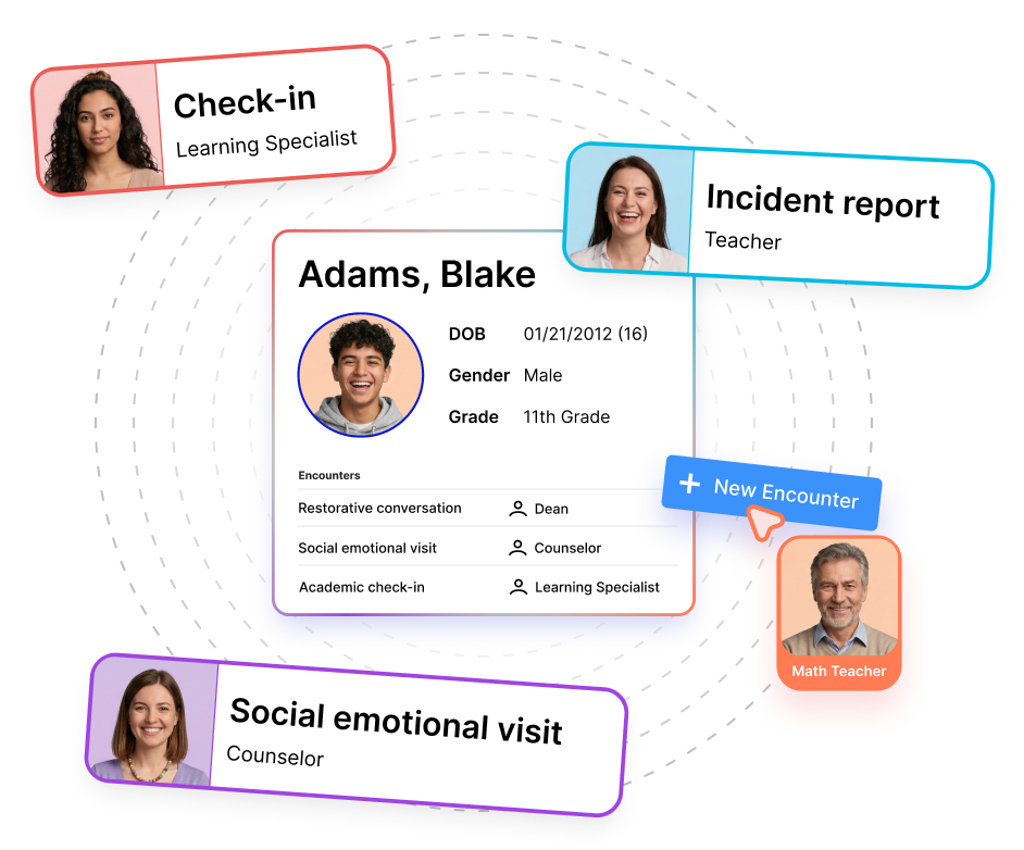
The storyboard opens with an attendance alert. The next scene shows the kinds of encounters staff can log, including a check-in or a restorative conversation. The last scene pulls back to a chart where someone can look more closely at wellbeing concerns. We designed the sequence to play on its own so a visitor could follow it while reading the page.
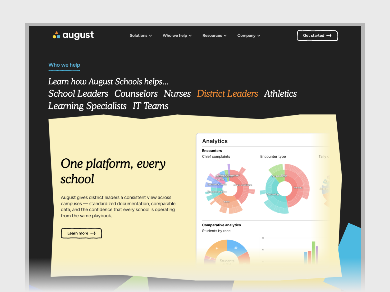
On the rest of the site, we got more specific about who was using August. Think about a school counselor with a few minutes before a student comes in. They might open August to look back at an earlier check-in or review the mental health information available to them. For that graphic, the details that mattered were the ones that could help the counselor go into the conversation with more context.
A teacher’s example starts somewhere else. Something happens in class, and the teacher wants to get it into the student’s record while it’s still fresh. August lets them dictate an update. That gave us a different kind of graphic to make. We could show a moment from the school day and the action the teacher takes right afterward.
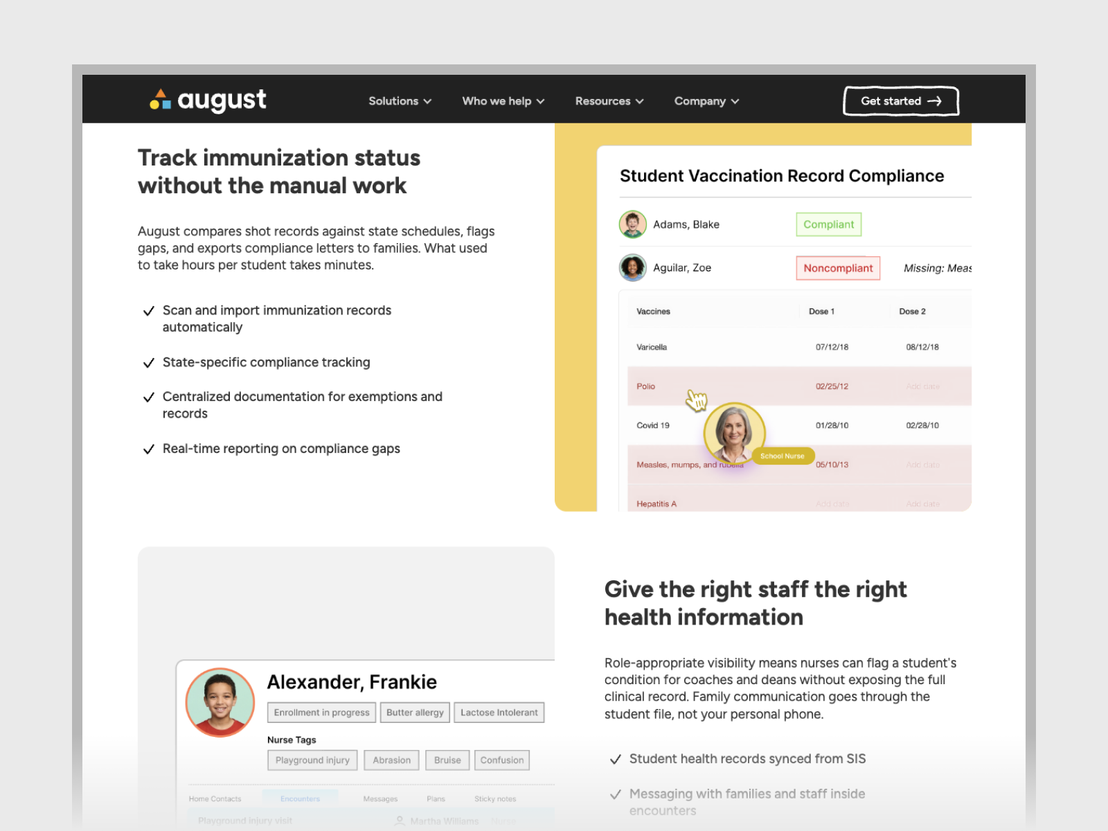
We used AI to generate a set of portraits, then picked a handful of students, teachers, and staff for the website. We gave each person a name and a role, and kept the same name and face wherever they appeared in the product graphics. If you saw a student’s portrait on a card on the homepage, you could recognize that same student in another part of the interface.
Once you’ve seen the counselor in one graphic, you know who they are when they turn up on another page. The same goes for the principal or a teacher. As you go through the site, those scenes start to feel like different moments in the same school. You can see who’s involved and how their work fits together.
Generating the portraits gave us control over how the photography looked and felt across the site. We could build a whole cast that fit the August brand without using anyone’s real identity or taking on the cost of casting and photographing that many people.

We relaunched the entire August Schools website and redid every product graphic around this idea. Some graphics showed what a staff member could learn by opening August. Others showed what they could do with it in the middle of their day. Each one paired a recognizable moment at school with the part of the product that belonged in that moment.
The homepage introduced that idea through one student. The rest of the site gave teachers, counselors, and other staff a chance to see what it would look like in their own work.
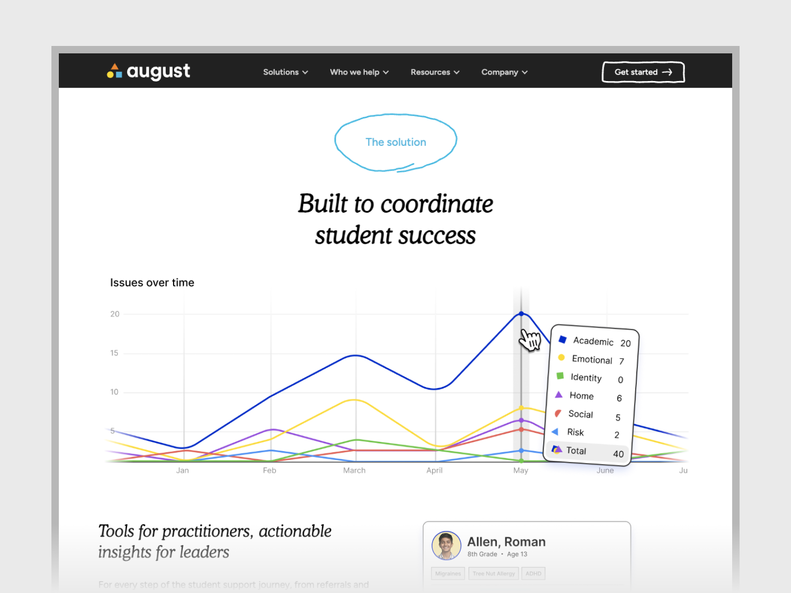
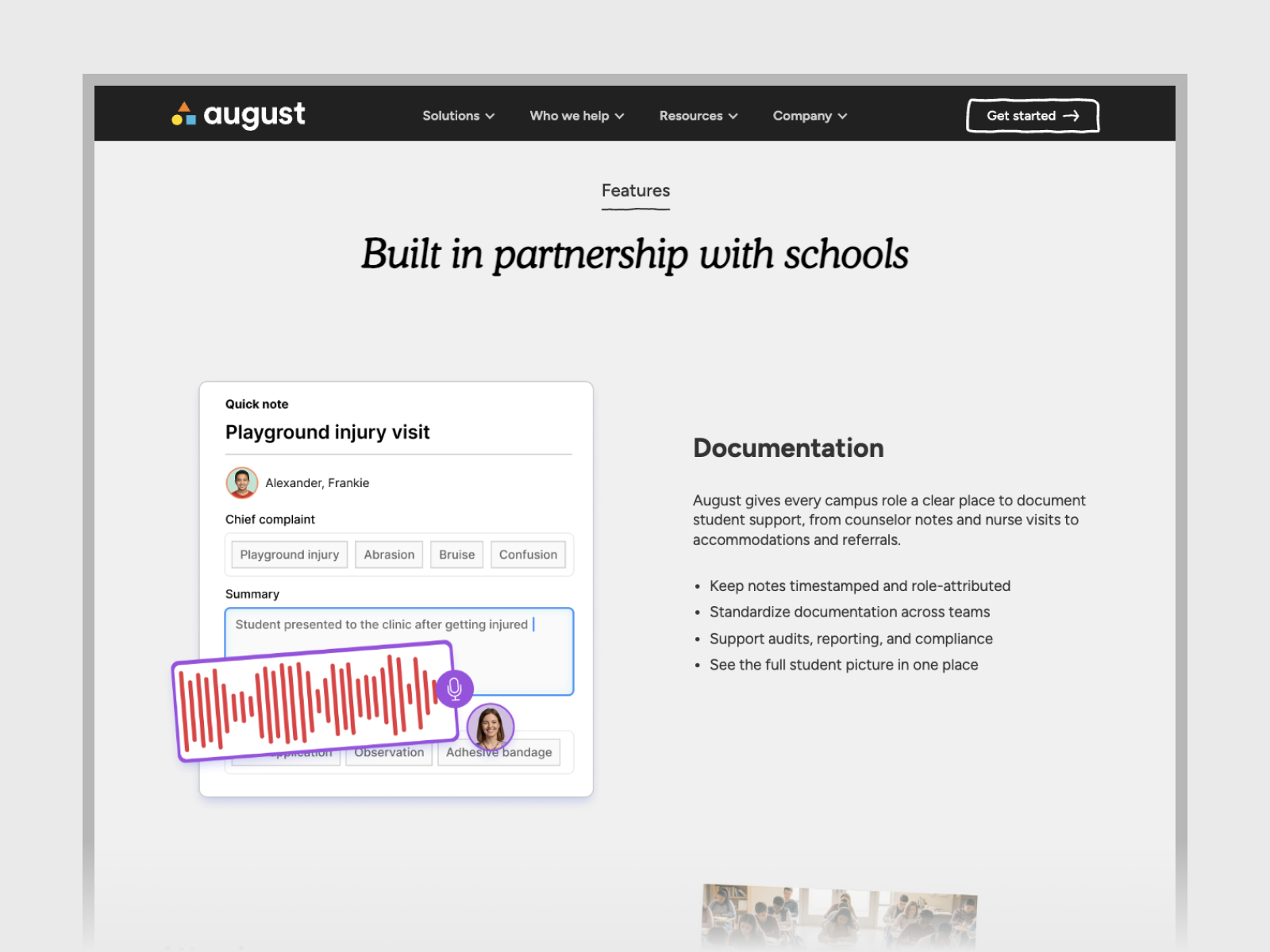
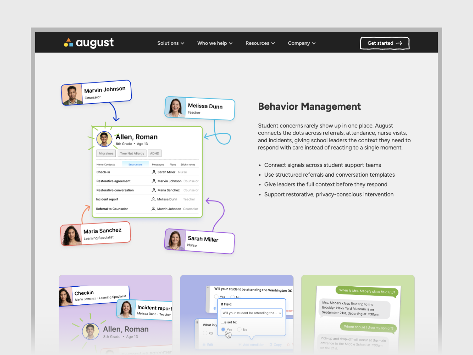
What started as a question about the homepage ended up shaping the whole website. When we relaunched the August Schools site, we’d redone every product graphic around something that happens in a school day. The people in the images gave each scene a context, and the software showed what someone could do next.
The homepage gives everyone a place to start by following one student. From there, a teacher can picture recording an update between classes, and a counselor can see what they might have in front of them before a check-in. Taken together, those moments show why it matters that August brings different parts of student support into one place. You can get a sense of how the pieces fit together before you’ve even seen a demo.


