BrandZap
George Little
Case Study
Industry
Construction & ACA Compliance Software
Core Technology
Figma, PowerPoint, Canva, BrandZap Kit
Engagement
Brand Refresh & Marketing Toolkit
Focus
Consistency & Internal Usability
Points North has been making software since the ’90s. Its products help employers keep up with payroll and compliance reporting, the kind of work where getting the details right matters. Over the years, the company had grown into a business with several products under one name. It was time for the brand to catch up.
Points North brought us in through BrandZap’s Brand Refresh package. The focus was on how the company looked. We could rethink the logo, colors, typography, and graphic style while keeping much of the voice customers already knew. The team could then take that new look into the work ahead, from the next sales deck to a future website.
By the time we started working together, Points North had already brought products that used to have their own websites onto one site. Certified Payroll Reporting and WageIQ served construction teams, while ACA Reporter helped employers handle Affordable Care Act reporting. The new identity needed to work for Points North as a whole and for each product when it was marketed on its own.
Think about someone who first comes across WageIQ in a software marketplace, then sees Certified Payroll Reporting in a sales presentation. What would tell them those products belong together? It’s easy to see when all the designs are lined up in front of you. On a marketplace card, you might have just a small logo, a screenshot, and a few seconds to make that connection.
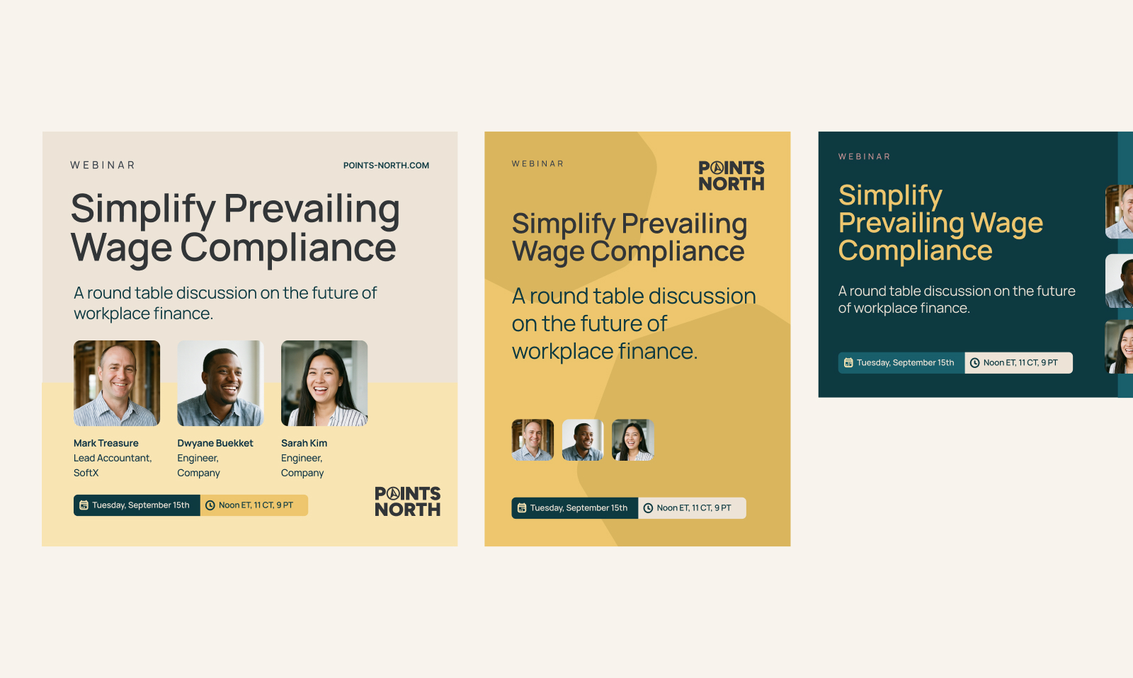
We explored three directions and showed how each could work in the kinds of materials Points North actually needed. The team gravitated toward the option with more color and energy. As we refined it, we looked for places where that personality could do some work. A layered shape could draw your eye to a product screenshot. A big block of yellow could give a slide cover some presence. On a slide with a lot to read, a light background and clear type could do more for the reader.
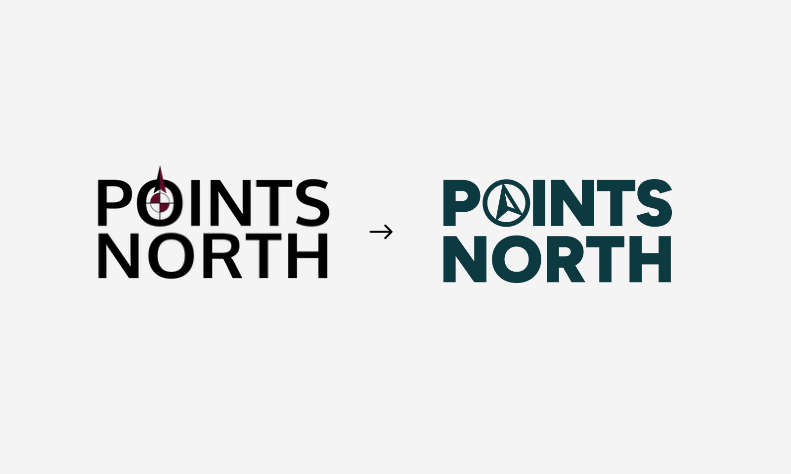
We also looked at what people already recognized in the brand. The existing logo had a compass in place of the O in POINTS, with the name stacked on two lines. We kept that idea and redrew it. Merchandise gave us a practical test along the way. The compass and the name still had to read clearly when the printer had only one color to work with.
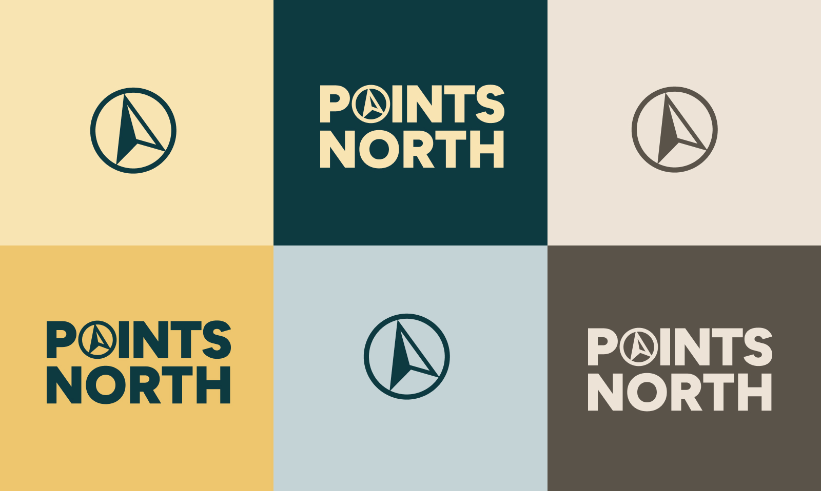
In the finished logo, the compass sits inside the wordmark and can also stand on its own. We paired it with deep blue-green, soft yellow, pale blue, and warm tans. We chose Manrope for the typography, using heavier weights for headlines and lighter ones where a slide or one-pager had more to say. You can see that range in the presentations. A cover can lead with yellow, while a slide explaining a product gives the screenshot and the text most of the room.
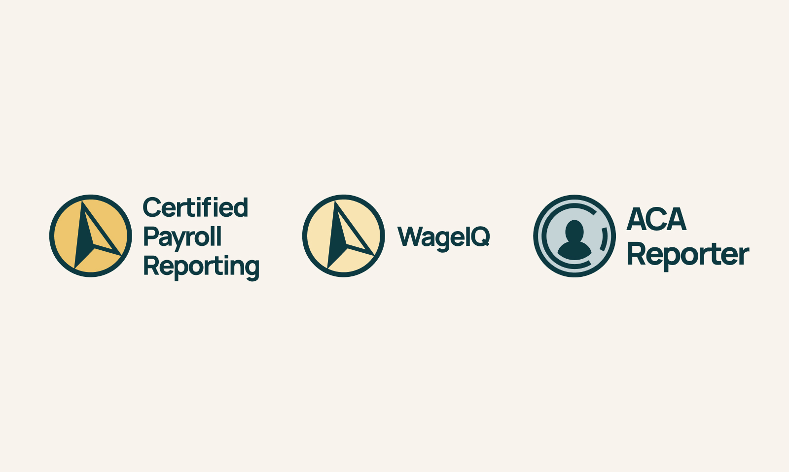
Certified Payroll Reporting and WageIQ use the same compass with two shades of yellow. Put the marks side by side and you can see why they belong in the same construction suite, even before you read the names. For ACA Reporter, we explored different symbols within the same circular outline and used pale blue to give it some distance from the construction products. The product work grew out of the new Points North identity, right down to the shape of the marks and the way the names were set.
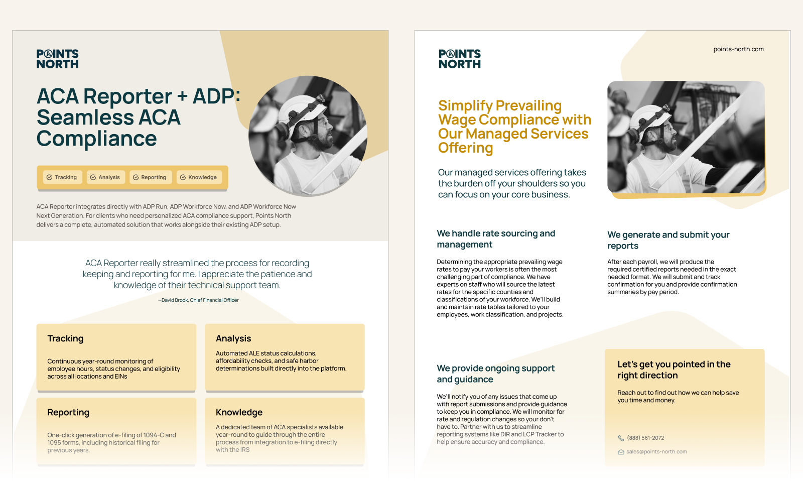
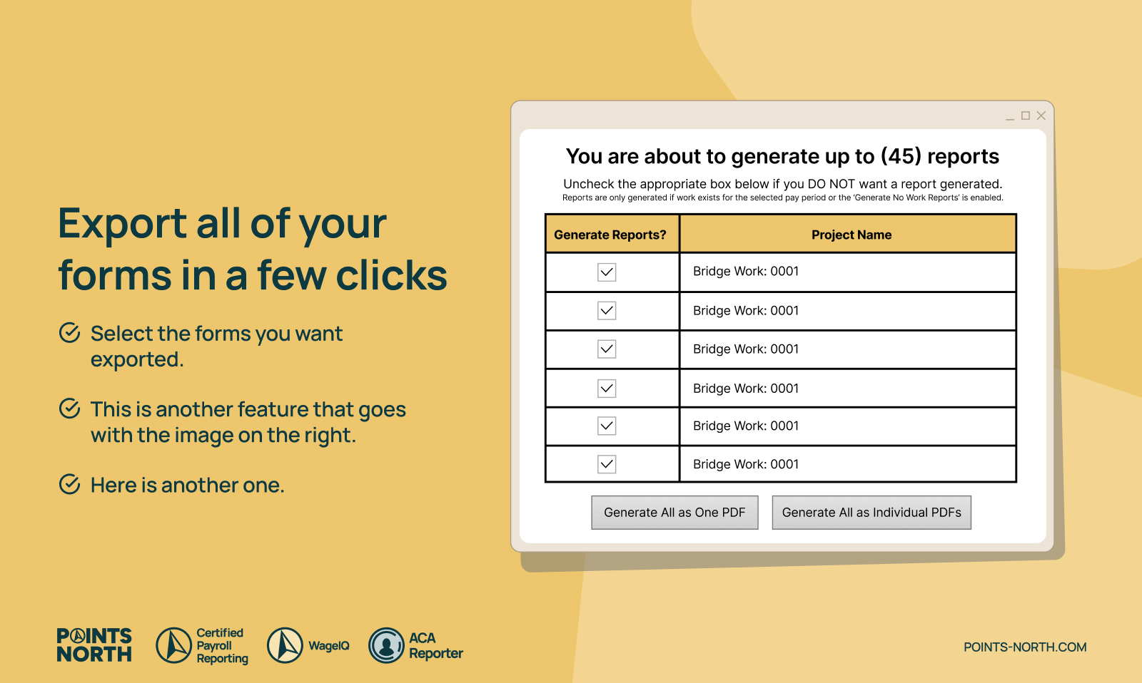
We carried the refresh into PowerPoint decks, editable marketing materials in Canva, business cards, and graphics for software listings. One marketplace card shows what it looks like to export forms. The headline gives you the action in plain language, and the screenshot shows where it happens in the product. It’s a small piece of marketing, but it has to explain something quickly and still look like it came from Points North.
The business cards had a different job. We designed one side for the company and one for the person. When a new employee needed a card, the team could open the Canva template and change their details while keeping the company side consistent.
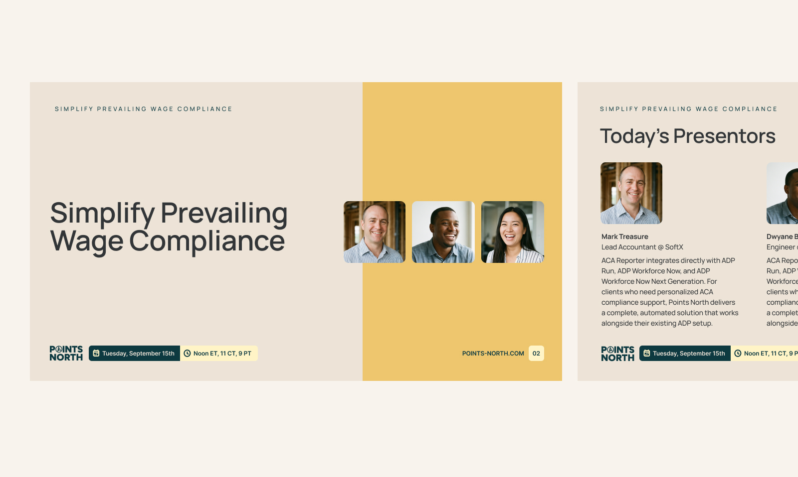
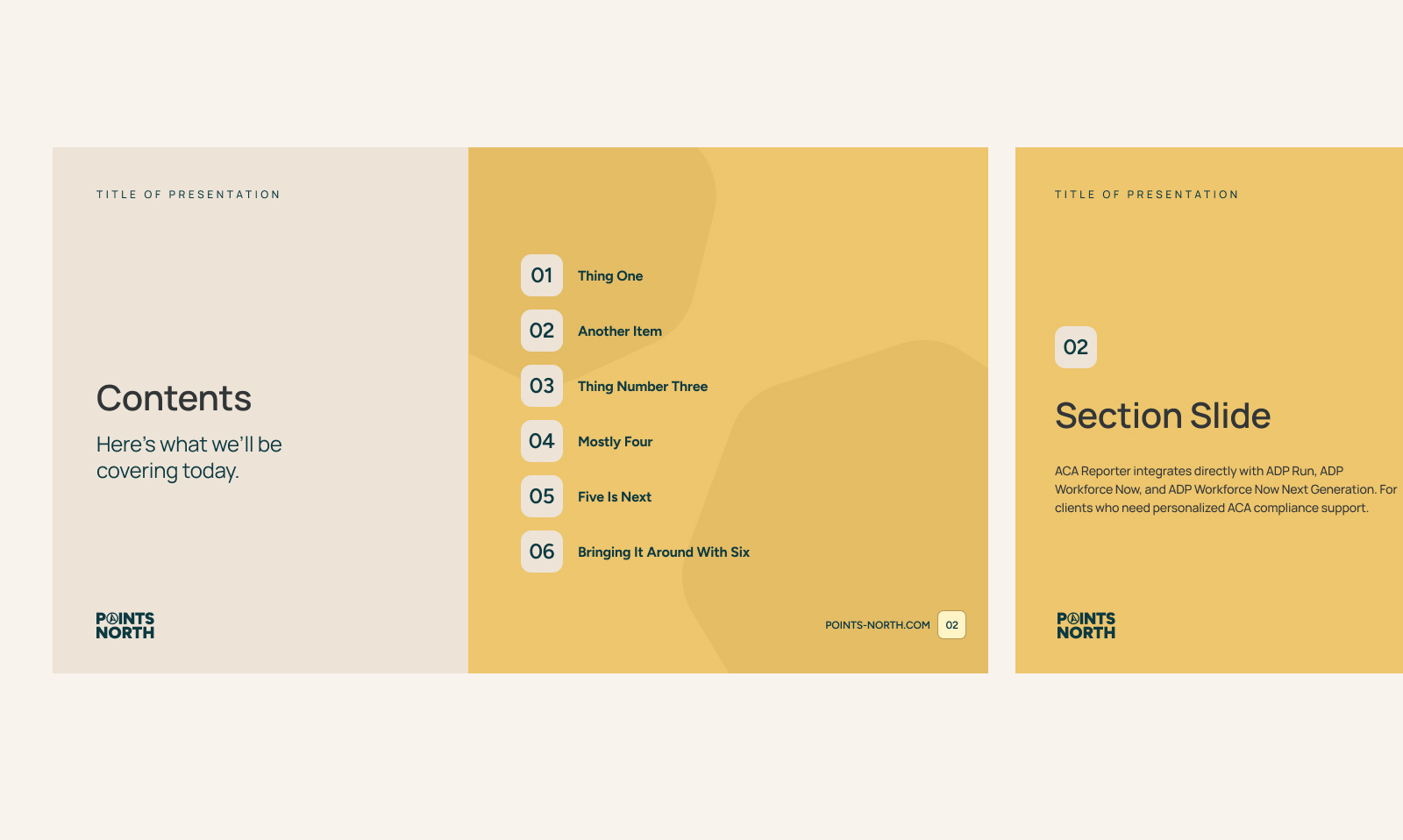
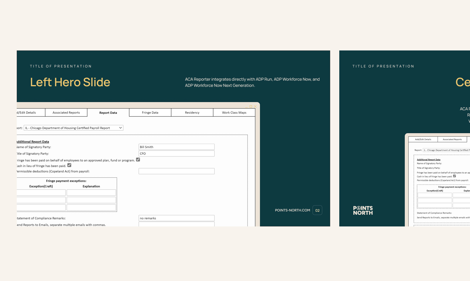
Points North came away with a redesigned logo, palette, and typography, plus sales and marketing materials that showed how to use them. The company could still sound like Points North, and the team could carry the new look into a full company presentation or a single product listing.
When it came time to make the next deck, the team had slides to open. When someone needed a new card, there was a template to edit. And for a future website, they had real examples of how the brand could handle everything from a big opening headline to the details of a payroll report.