
BrandZap
George Little
Case Study
August Schools builds tools that help student support teams—like nurses, counselors, athletic trainers, administrators, and IT teams—manage documentation, coordination, and day-to-day workflows more easily. The goal is to reduce operational stress so schools can spend more time supporting students and helping them thrive.
As the company’s website, brand system, decks, and marketing materials continued to grow, the need for iconography became more open-ended. A small, carefully designed set of icons worked well at the beginning, but the internal team would inevitably need new icons for new pages, product concepts, sales materials, and collateral. In a school-focused product environment, those icons might need to represent anything from student records and health workflows to dashboards, communications, compliance, or parent engagement.
That kind of asset creation is deceptively difficult. Icons look simple, but consistency depends on small visual decisions: line weight, detail level, shape language, proportions, and the amount of personality in each drawing. For August Schools, the icon style was especially specific. The brand used hand-drawn, slightly wobbly single-line icons that felt almost like chalkboard sketches — a visual cue that connected naturally to the company’s school-based audience.
The challenge was not just creating more icons. The challenge was creating a system that could continue producing new icons in the same visual style after the initial design work had been completed.
Most brand systems are built around fixed assets. A designer creates the logo, colors, typography, icon set, and supporting graphics, then hands those elements off to the internal team. That works well for assets that do not need to change often. But iconography is different.
Icons are tied directly to subject matter. As soon as a product, website, or marketing campaign introduces a new concept, the team needs a new visual representation. When that happens, internal teams usually have three imperfect options: reuse an existing icon that does not quite fit, pull something from a third-party library that does not match the brand, or request a new custom icon from a designer.
Each option creates a different kind of problem. Reusing icons weakens clarity. External libraries introduce inconsistency. Requesting custom icons slows the team down and turns small production needs into recurring design bottlenecks.
For August Schools, this mattered because the icon system was not generic. The brand’s wobbly, hand-drawn style required a level of artistic judgment. The lines needed to feel casual, but not messy. The details needed to be simple, but still recognizable. The icons needed to feel like they belonged together, even when the subject matter changed.
So the core question became: How can a custom visual style be handed off in a way that lets the team create more of it later?
Rather than manually expanding the icon library one icon at a time, BrandZap built a repeatable AI workflow that could reproduce the August Schools icon style across new subject matter.
The goal was not to replace design judgment entirely. The goal was to move the most repetitive part of the process into a structured workflow, while preserving the brand-specific decisions that made the icons feel intentional. In other words, the project was less about generating random AI imagery and more about encoding a visual style into a reusable tool.
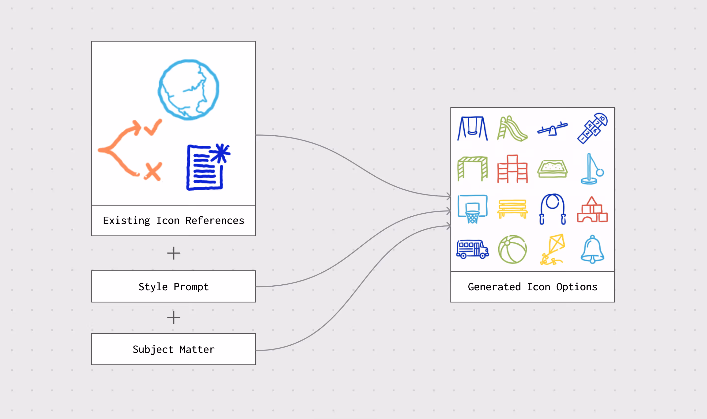
The workflow was built using a node-based AI system, referred to in the original process as Wavy/Weavy, which allowed multiple steps to be chained together. Instead of relying on a single prompt, the workflow used a sequence of inputs and transformations: original icon references, written style direction, brand color variables, generation, refinement, and vectorization.
This made the process more reliable than a one-off image generation prompt. Each step had a specific role in moving the output closer to something the August Schools team could actually use.
The first step was to teach the workflow what the August Schools icon style looked like.
BrandZap started with a small set of existing hand-drawn icons that had already been created for the brand. These served as visual reference material. Alongside those examples, the workflow included a written prompt describing the intended style: single-line icons, slightly uneven hand-drawn edges, minimal detail, a sketch-like quality, and a chalkboard-inspired feeling that fit naturally within a school environment.
That combination of visual references and written direction became the foundation for generating new icons. The system could take a subject — for example, a student dashboard, attendance workflow, health record, or classroom engagement concept — and produce a grid of options that attempted to match the established style.
The first output was not expected to be perfect. It was treated as a concept-generation layer: a way to explore variations quickly while staying within the right general visual language.
One of the first key discussions revolved around naming. Internally, there was debate about whether the company should present itself as “OmniModeler,” which framed it as a potentially broader modeling company, or lean into “CapModeler,” the name of the current product.
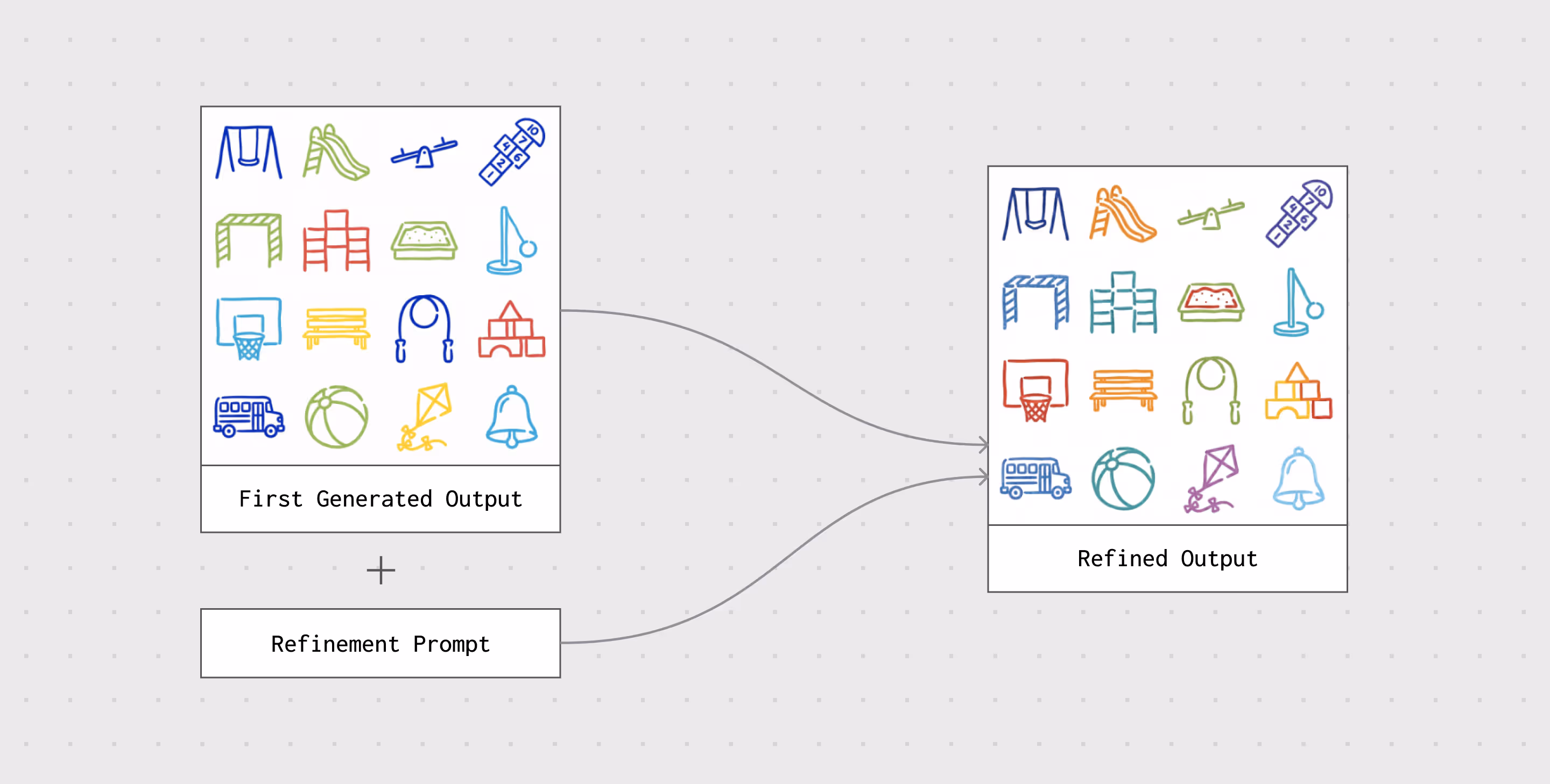
The next step was refinement.
AI-generated visual assets often get close to the desired direction but still miss small details that matter in a brand system. In this case, the generated icons could capture the general hand-drawn quality, but they still needed additional tuning to better match the original August Schools style.
To solve that, the workflow passed the generated icons through a second refinement layer. This layer effectively redrew the icons with closer attention to consistency. The refinement step helped simplify shapes, align proportions, reduce unnecessary detail, and bring the line work closer to the original icon set.
This was the step that made the output feel less like a generic AI image and more like an extension of a specific brand system. It added a layer of quality control before the icons moved into production.
Once the refined icons were created, they still had to be converted into a usable design format.
The AI workflow initially produced raster images. Those were useful for previewing and choosing directions, but they were not ideal for production. August Schools needed icons that could be used across the website, decks, and collateral, which meant the final assets needed to be clean, editable, and scalable.
BrandZap added a vectorization step to the workflow. The background was removed, the line work was isolated, and the icon was converted into SVG format. From there, the icon could be adjusted to match the correct brand color and exported for use across Webflow and other marketing materials.
This final step was important because it turned the workflow from a creative experiment into an actual production tool. The output was not just a picture of an icon. It became a usable brand asset.
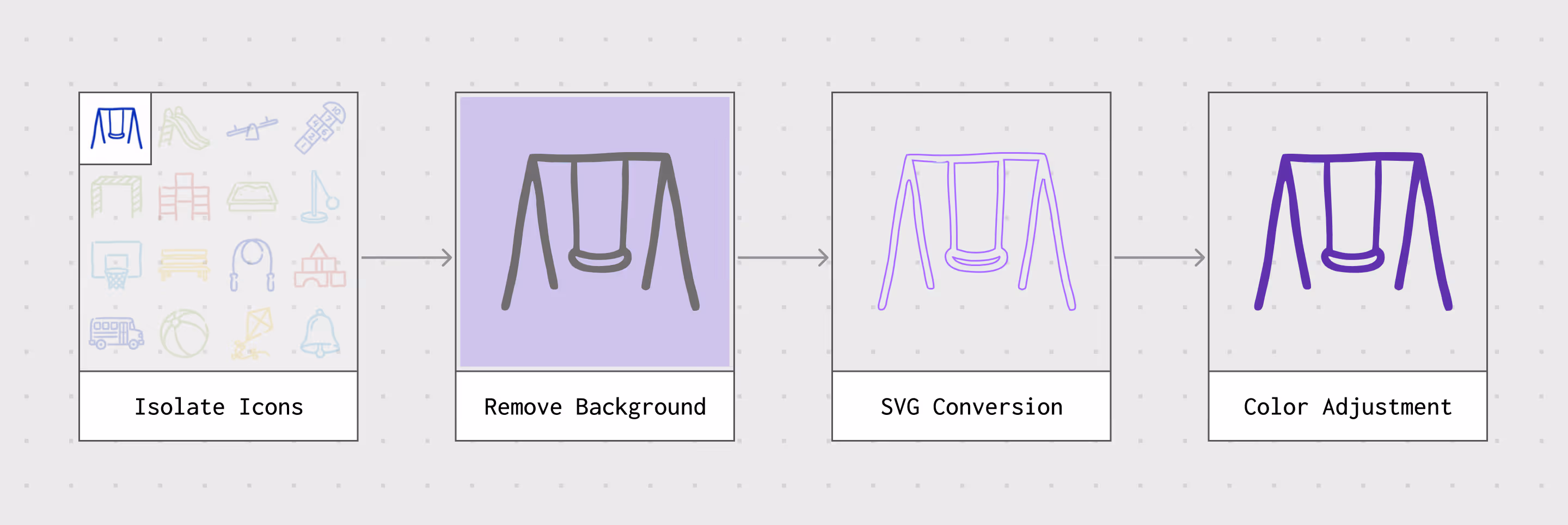
So the final step was converting them into vector format:
The most valuable part of the project was that the workflow did not end with a single batch of icons.
Once the system was set up, August Schools could continue using it to create new icon options as needs emerged. Instead of starting from scratch, the team could return to the flow, update the subject matter, and generate a new set of icons in the same visual style.
That changed the role of the design work. The deliverable was no longer just an icon library. It was a repeatable process for extending the icon library.
For BrandZap, this also created a more efficient way to support the client over time. Instead of manually drawing every new icon request, the effort went into designing the workflow, encoding the style, and creating a repeatable production system. From there, the client could generate new options, choose the strongest ones, and keep their materials moving without compromising the brand.
The final workflow gave August Schools a scalable way to maintain and extend its custom iconography system.
For the internal marketing team, it reduced dependency on external design support for every small visual need. New decks, collateral, website sections, and campaign assets could be supported with icons that felt aligned with the existing brand. For BrandZap, it reduced repetitive production work while preserving creative control over the visual system.
Most importantly, the workflow helped solve a common brand handoff problem: how to keep a custom identity consistent after the original design work is complete.
For the brand, it meant the icon system could grow without drifting.
Instead of handing over a fixed set of icons and hoping they would be enough, BrandZap created a system for making more. The result was a more flexible brand asset pipeline — one that combined design direction, AI generation, refinement, and production-ready SVG output into a repeatable process.
A strong brand system should not only define what exists today. It should also help teams create what they need tomorrow.
For August Schools, AI was not used as a shortcut around branding. It was used as a way to make the brand more operational — turning a custom visual style into a repeatable workflow that could support the team as the company’s marketing needs continued to expand.


-2000.webp)
-1200.webp)