BrandZap
George Little
Case Study
Industry
Transportation & Logistics Software
Core Technology
Webflow, PostHog, Figma MCP, Codex
Engagement
Ongoing Website Strategy, Design & Development
Focus
Product Storytelling, Conversion & Experimentation
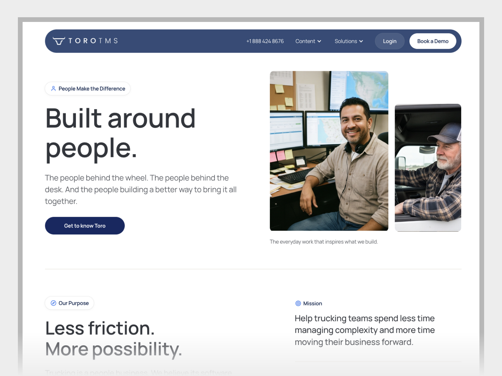
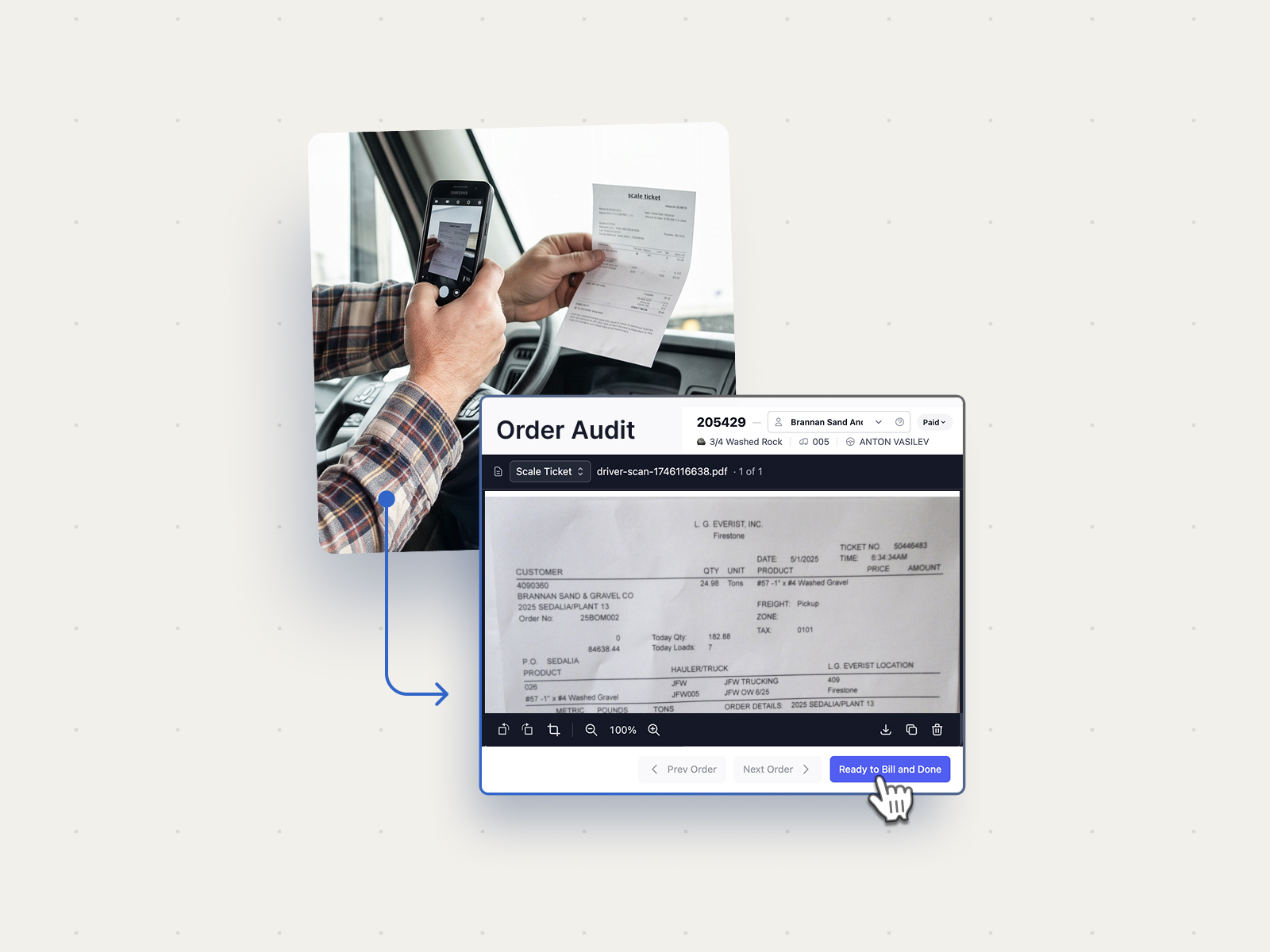
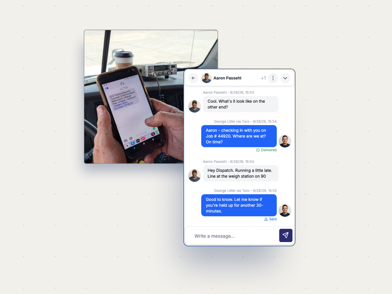
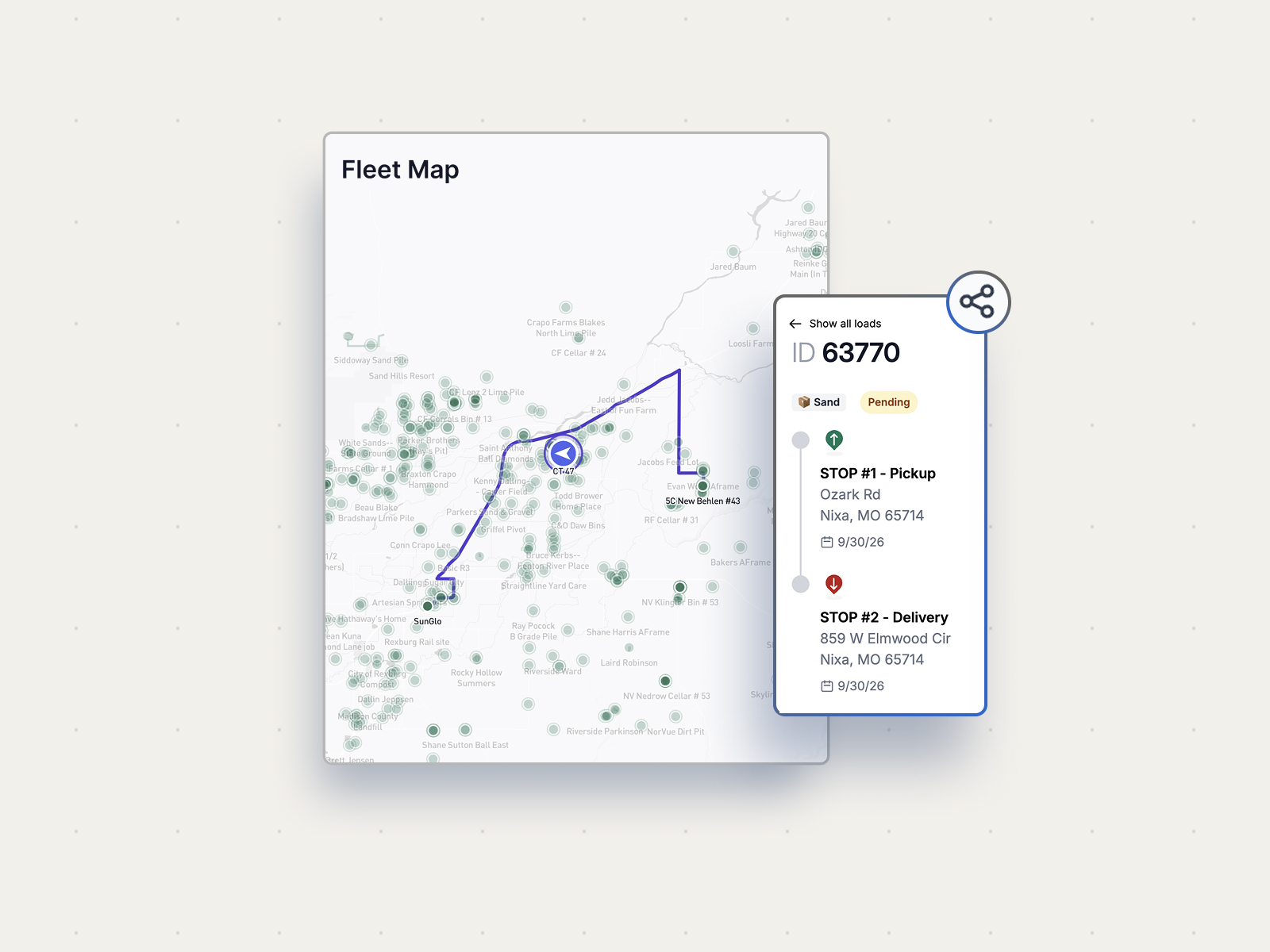
Toro makes transportation management software for bulk haulers. Dispatchers use it to plan and send out loads. Drivers can get their instructions by text and send documents back from their phones. The back office can use those documents to get an invoice ready. It’s one job moving through several people, and what each person needs to see is a little different.
A dispatcher gets a call that changes the afternoon. A load has to move to another truck, the driver needs the new details, and the office still needs the paperwork once the delivery is done. That’s the kind of day Toro TMS is built for. It’s also a useful way to think about what someone should see when they land on the website.
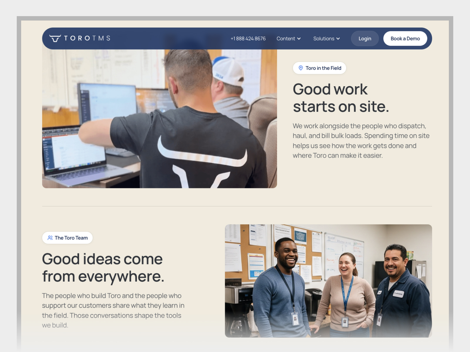
We joined Toro as a design and development partner through our Flex relationship on an ongoing rebuild of its marketing site. We wanted the pages to show the product through work a hauler would recognize. We also wanted to make better use of the website Toro already had. People were coming to it with real questions, and we could learn from the routes they took through it before opening a new design file.
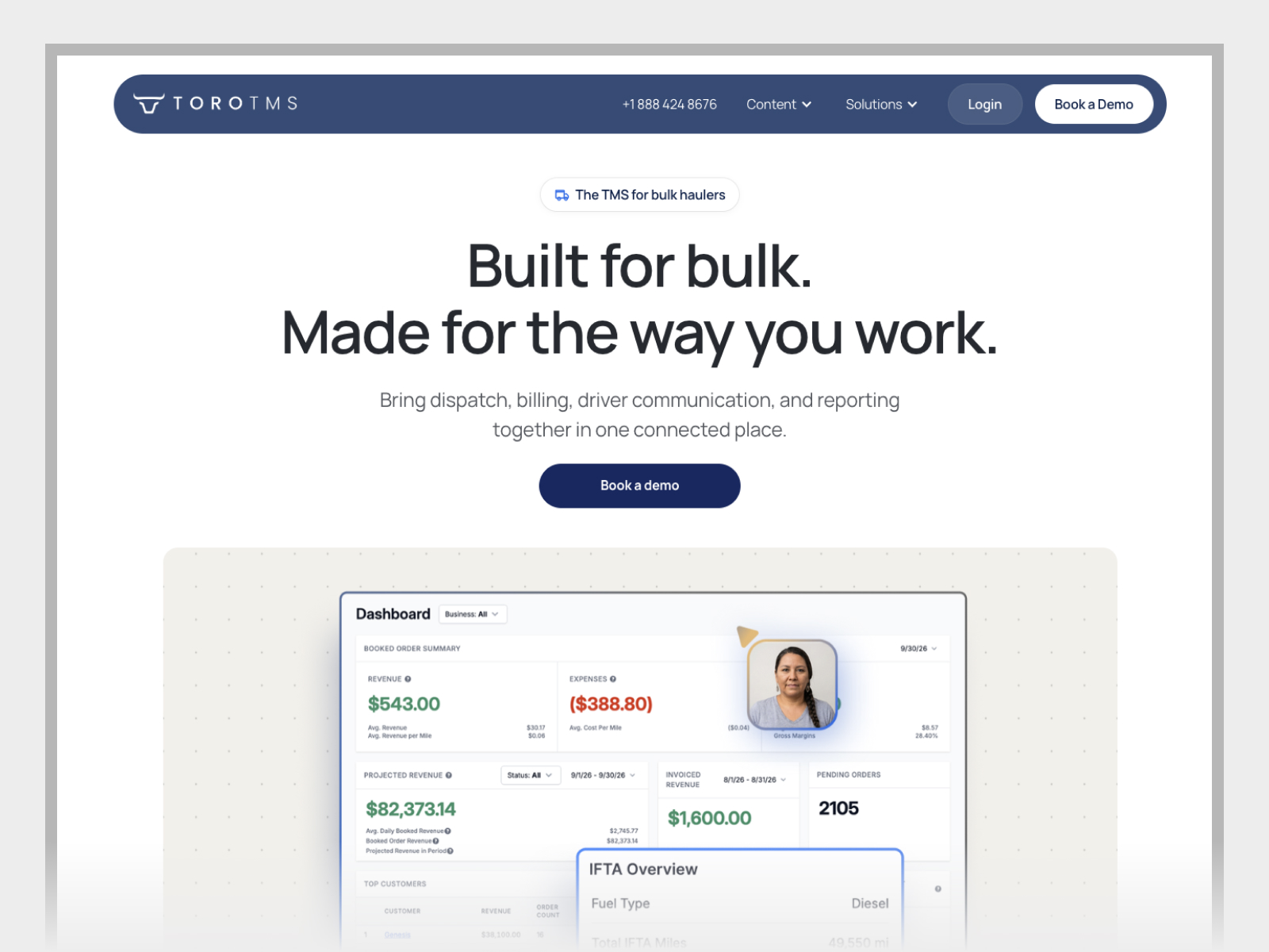
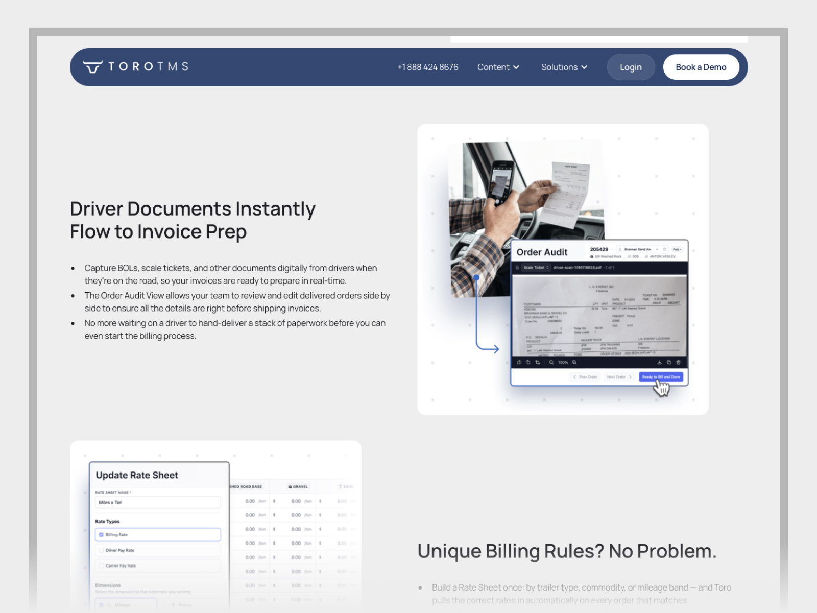
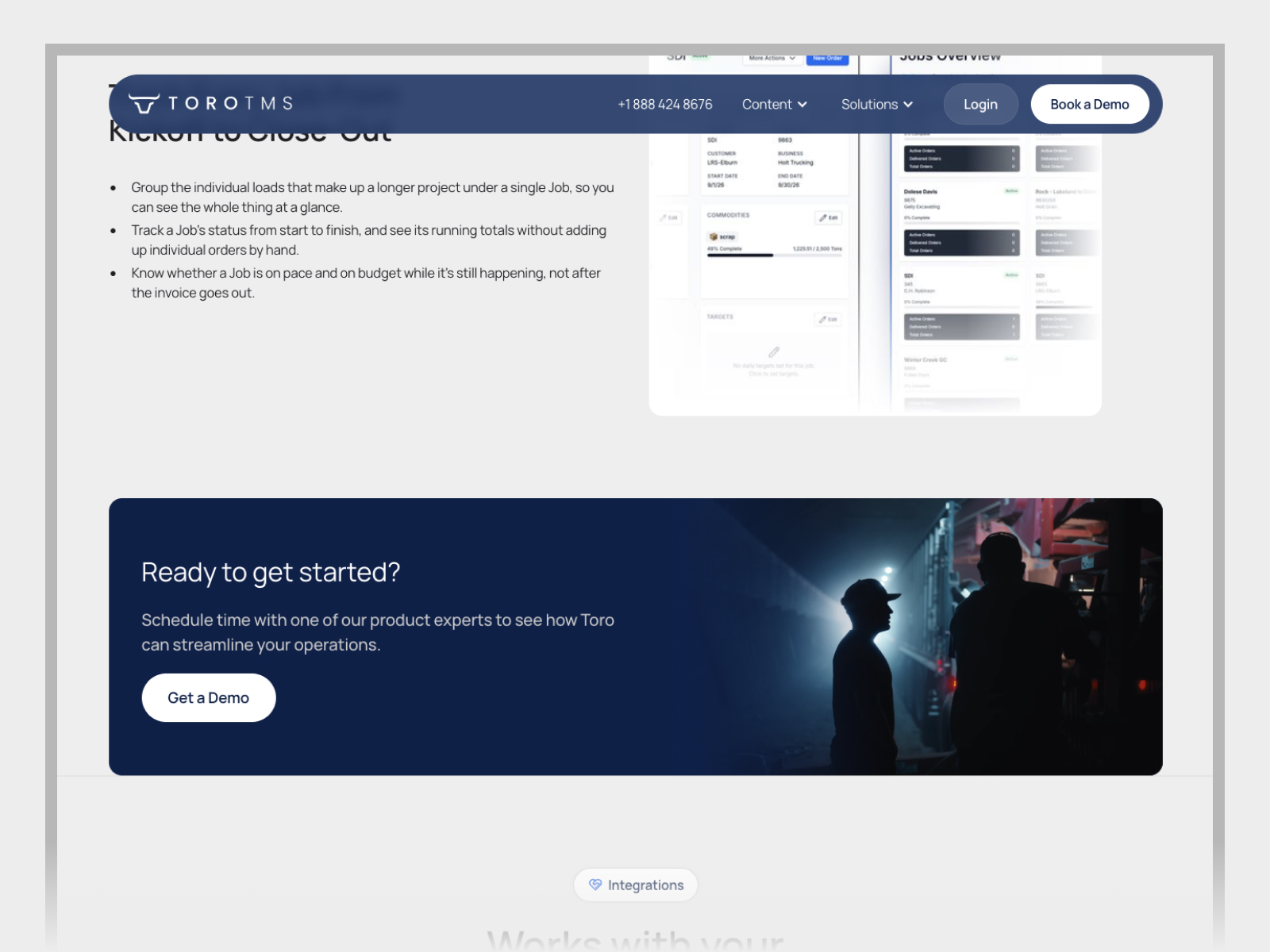
A person on the dispatch page might be trying to see how a change gets to a driver. On the accounting page, they might be wondering whether they can stop chasing paperwork at the end of the day. If we put a big screenshot in front of either person, they still have to figure out where to look. The page has to set up the situation and make it easy to see what the software does about it.
Those decisions get more obvious on a phone. On a wide screen, a product graphic and the sentence that explains it can sit next to each other. On a phone they stack, and you have to decide what the person sees first. The same goes for finding the next relevant page or deciding whether it’s time to ask for a walkthrough. A lot of the work was paying attention to those smaller moments.
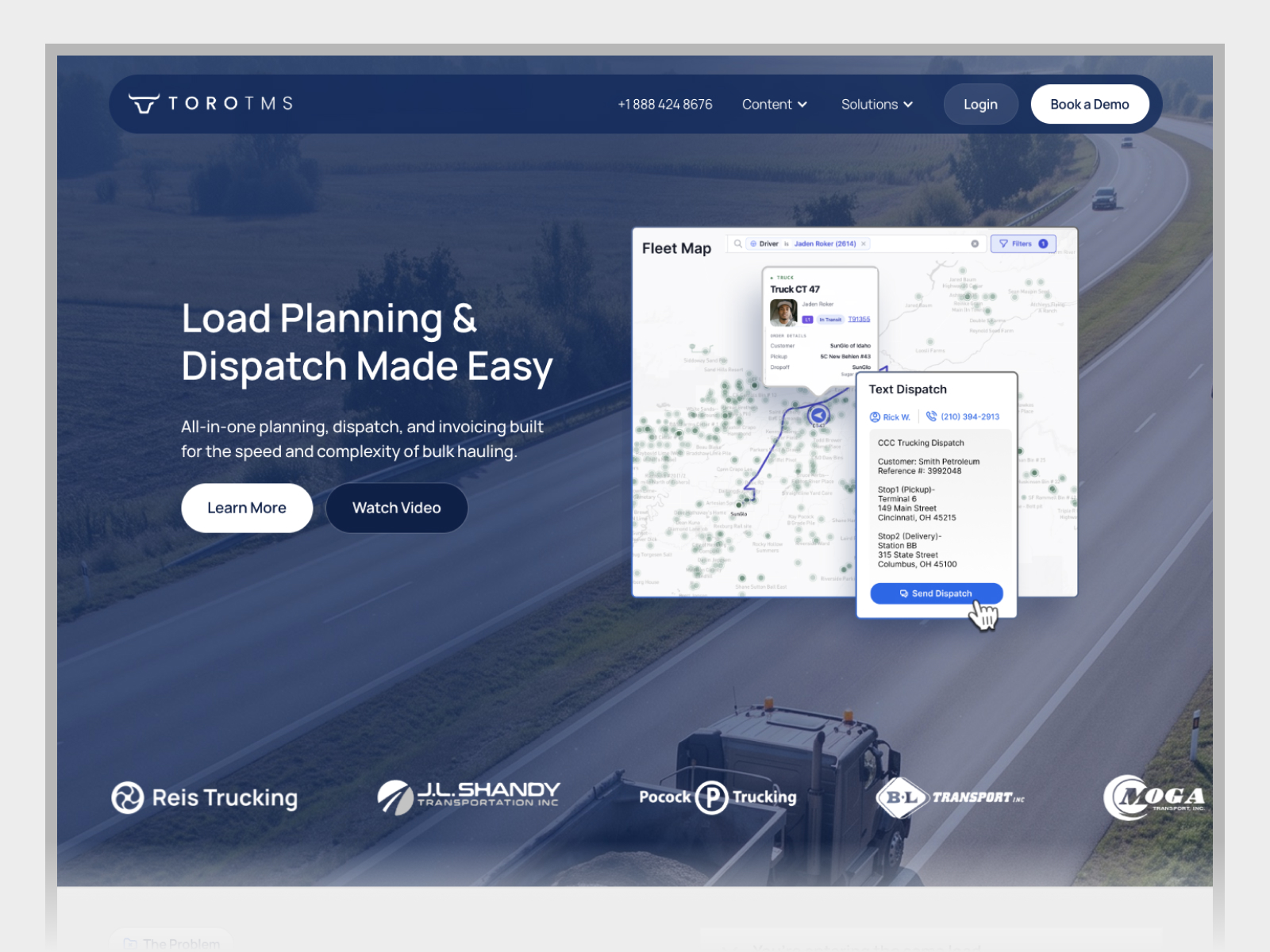
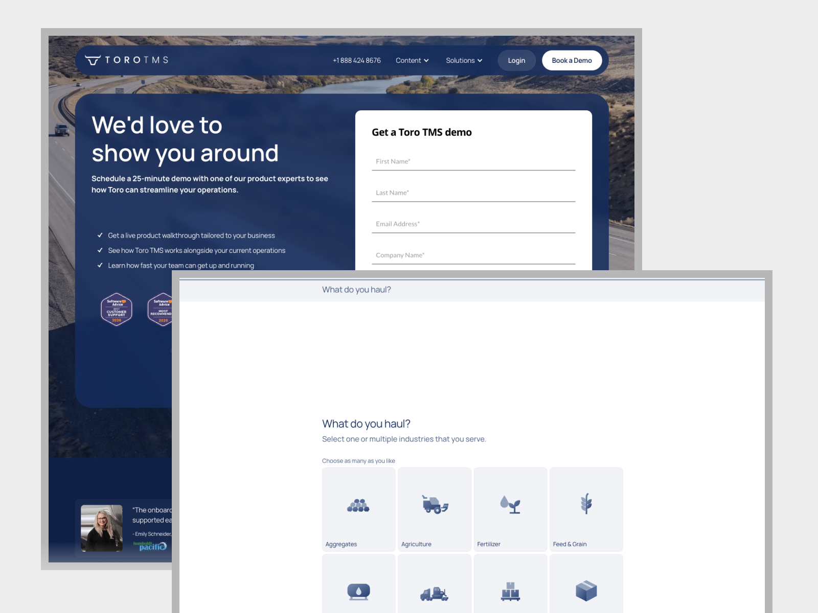
We used PostHog to look at how people moved through the site. One distinction we kept coming back to was the difference between clicking toward a demo and actually sending in a request. Both are useful to see. The click shows that someone was interested enough to take another step. The submission tells you they made it through and asked to talk. Looking at those actions separately gave us better questions about which part of the experience to look at next.
From there, we could open a page in Figma and work through a question with the Toro team. If the section is about sending a dispatch by text, what does someone need to see before the phone graphic makes sense? Can they follow what the driver receives and where the delivery paperwork goes next? When we knew the answer, we could give each piece of the page a clearer job.
We used Figma MCP to give Codex access to the design as we carried the work into Webflow. That meant the layout and the decisions around it were available during the build. We could go from reviewing a page together in Figma to looking at the working version in a browser, where we could see what held up at different screen sizes and what needed another pass. It gave us a way to keep design and development close while the site was evolving.
The new feature pages give dispatch, drivers, and accounting their own space. The dispatch page can start with planning a load and deciding who’s taking it. The driver page can pick up with the text the driver receives and the paperwork they can send back. Accounting can show what happens to those documents when it’s time to invoice. Someone can land on any one of those pages and follow the story. If they go through all three, they can see how the handoffs fit together.
The graphics could get more specific once the pages had that structure. A dispatch view can show where the load gets assigned. A phone view can show what the driver gets. An accounting view can show where the ticket ends up. Each piece helps somebody recognize a part of their own operation. On mobile, we could review the page in order and see where an image needed to move or where a reader needed a little more context before seeing it.
We also worked on how articles, resources, and customer stories fit into the site. A customer story and a practical guide can both help someone understand Toro, but people go to them for different reasons. The content structure gave the team a way to handle those different pieces in Webflow and gave visitors clearer ways to find them.
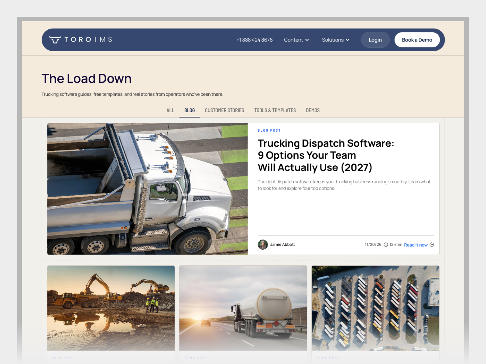
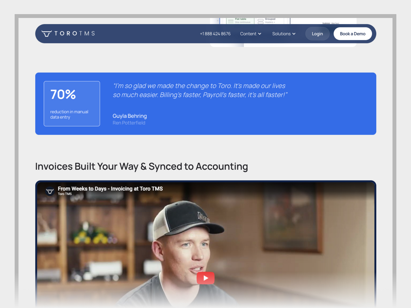
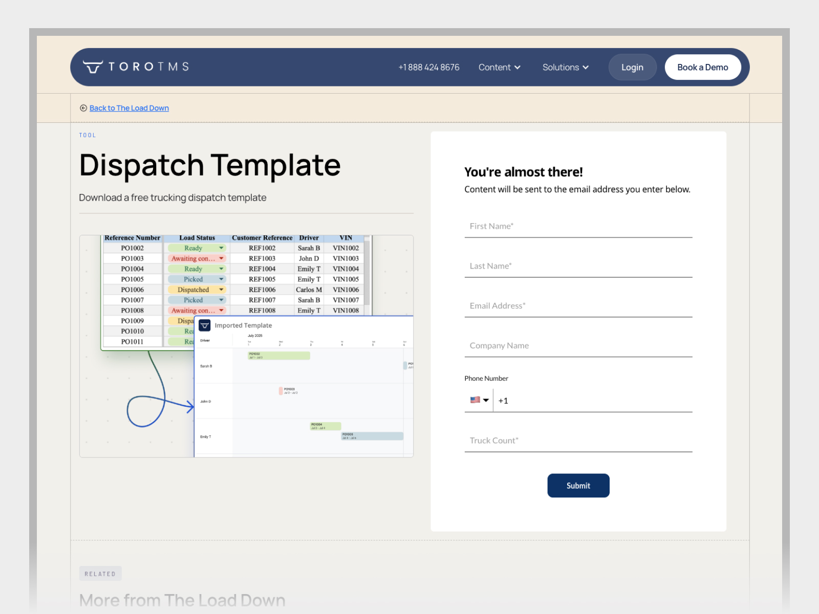
Toro has a live set of feature pages that explain the software through the people who use it. The partnership is ongoing, and those pages give us something concrete to learn from. We can look at how someone moves through the site, work through a design question with Toro, and carry the decision into a working page. Then we have a real experience to come back to when we’re ready to ask the next question.