BrandZap
George Little
Case Study
Industry
Wellness & Fitness Software
Core Technology
Webflow, Figma, Node.js
Engagement
Rebrand & Website Redesign
Focus
Brand Consistency & Product Clarity
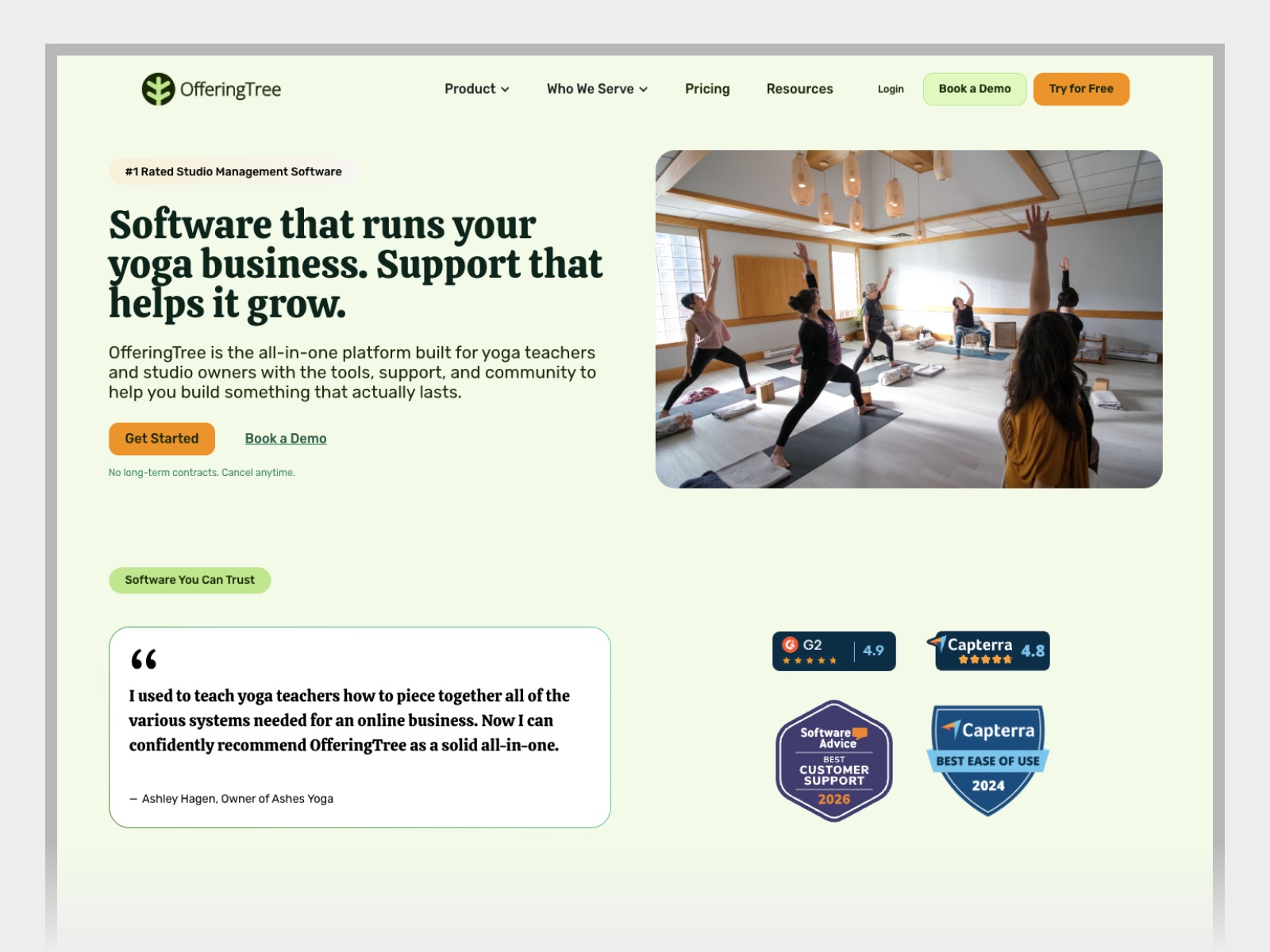
A yoga teacher might come to OfferingTree because she wants people to book a class without having to text her first. A studio owner might already have a website and be looking for a better way to handle memberships, payments, and a schedule that changes every week. OfferingTree brings those jobs together in one place. Its own website needed to help both people see where to start.
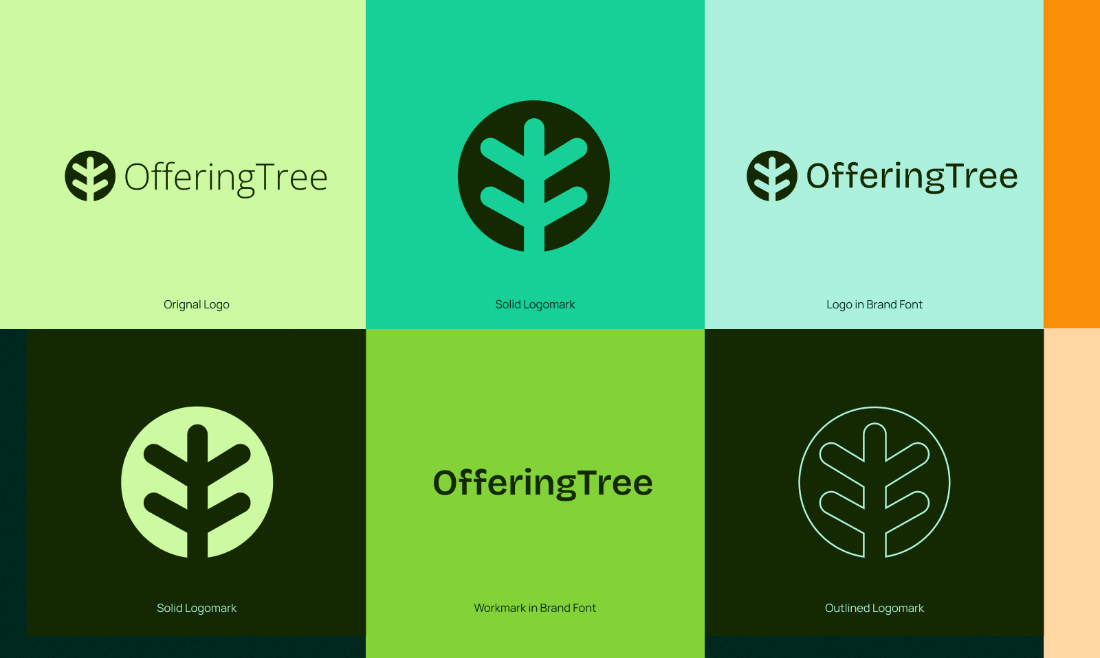
We started working together on a brand refresh. That grew into planning and designing a new marketing website, and eventually building it alongside the OfferingTree team. BrandZap became their main design partner. We carried the visual identity through, developed the way we’d show the product, and designed the individual pages. Then we worked directly with the team to get those designs into Webflow.
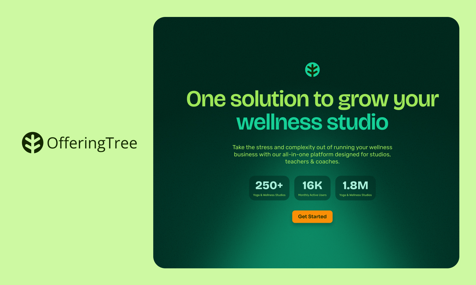

OfferingTree had plenty to show. Its software can run bookings, payments, memberships, marketing, and a studio’s website. That breadth makes sense once you’ve seen how the pieces fit together. On a homepage, though, it’s easy to give every feature equal weight and leave the person reading to figure out which one matters to them.
There was a brand question wrapped up in that. OfferingTree works with people who spend their days teaching classes, working with clients, and keeping studios running. We wanted the site to feel like it belonged in their world. That had to come through on a page full of product details as much as it did on a page with big studio photography. And once the site was live, the team would need to carry that same identity into the things they make every week.
We brought the new brand into page designs early. A green that feels right on a palette can behave differently behind a checkout screen. A headline that looks great in a short brand example has to hold up on a page with pricing, testimonials, and a handful of different sections. Working through those decisions in Figma gave us something specific to look at with OfferingTree. We could see what happened to the page when we changed an image or turned up the color.
We also followed a few different routes through the site. If you’re coming in on a page about running a Pilates or yoga business, you want to see how the software fits a studio like yours. If you’re coming in to evaluate the website builder, you’re probably ready to see what you can make with it. Thinking through those visits helped us decide what the homepage needed to introduce, which details belonged on their own pages, and where examples, pricing, or a demo would help someone take the next step.
As we got closer to launch, the same exercise helped us decide what to finish first. The product graphics and navigation that people would rely on to get through the site came first. We could keep refining other parts of the brand once the new site was out and we could see the whole thing working together.
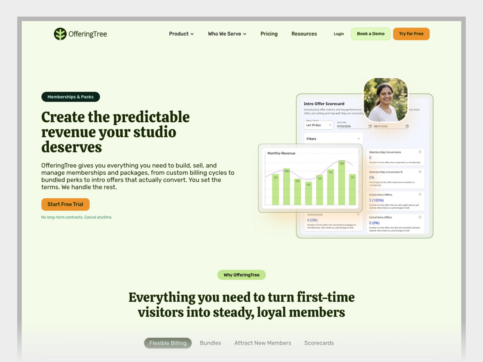
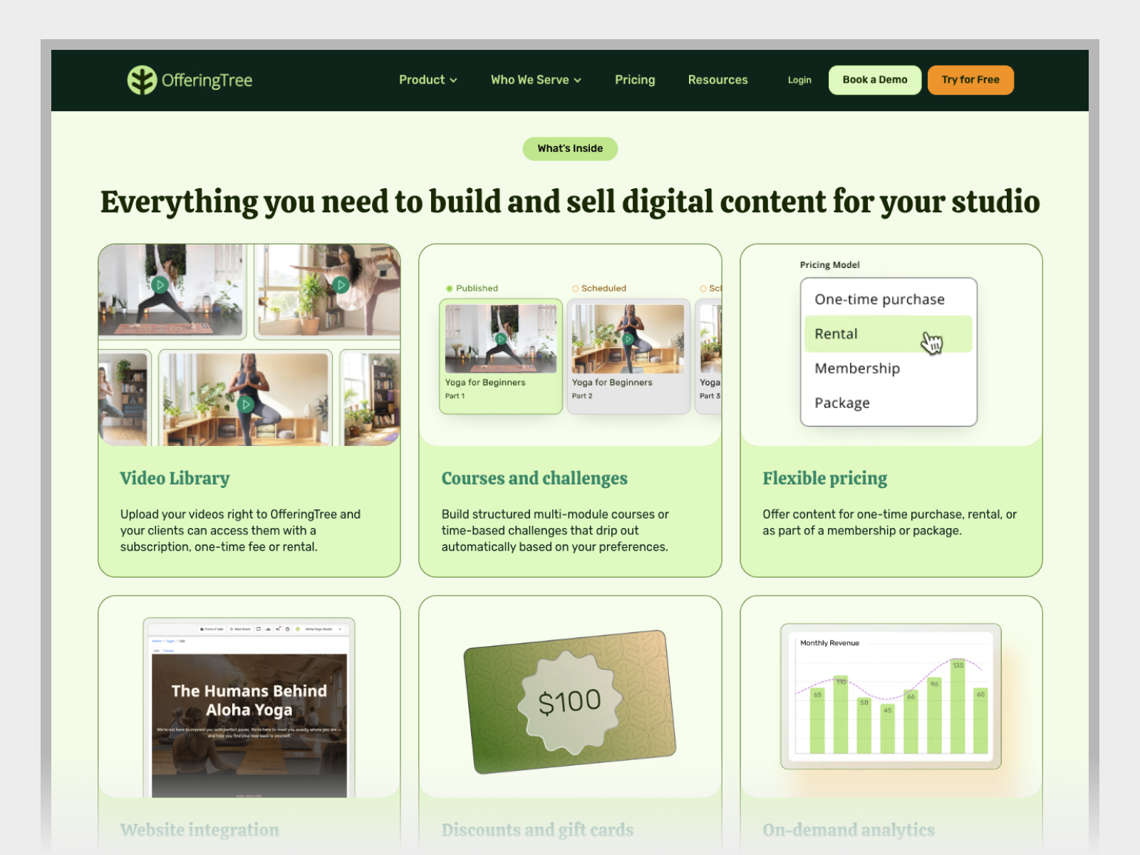
One of the clearest examples was the class schedule. Inside the app, a studio owner might need to see upcoming classes alongside several other things. On the website, we could bring the schedule to the front so someone could get a sense of what managing a week looks like. We handled a membership checkout the same way. The monthly plan and payment choices stayed in view, and the rest of the interface could recede. We started with the real product and composed each graphic around the moment the page was explaining.
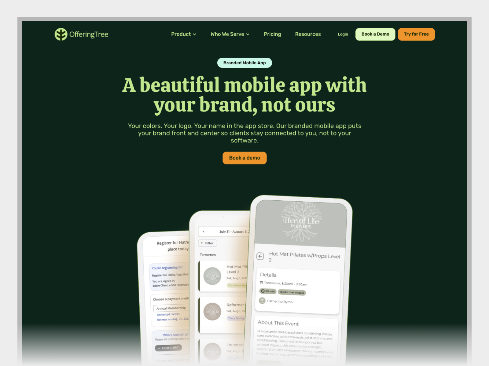
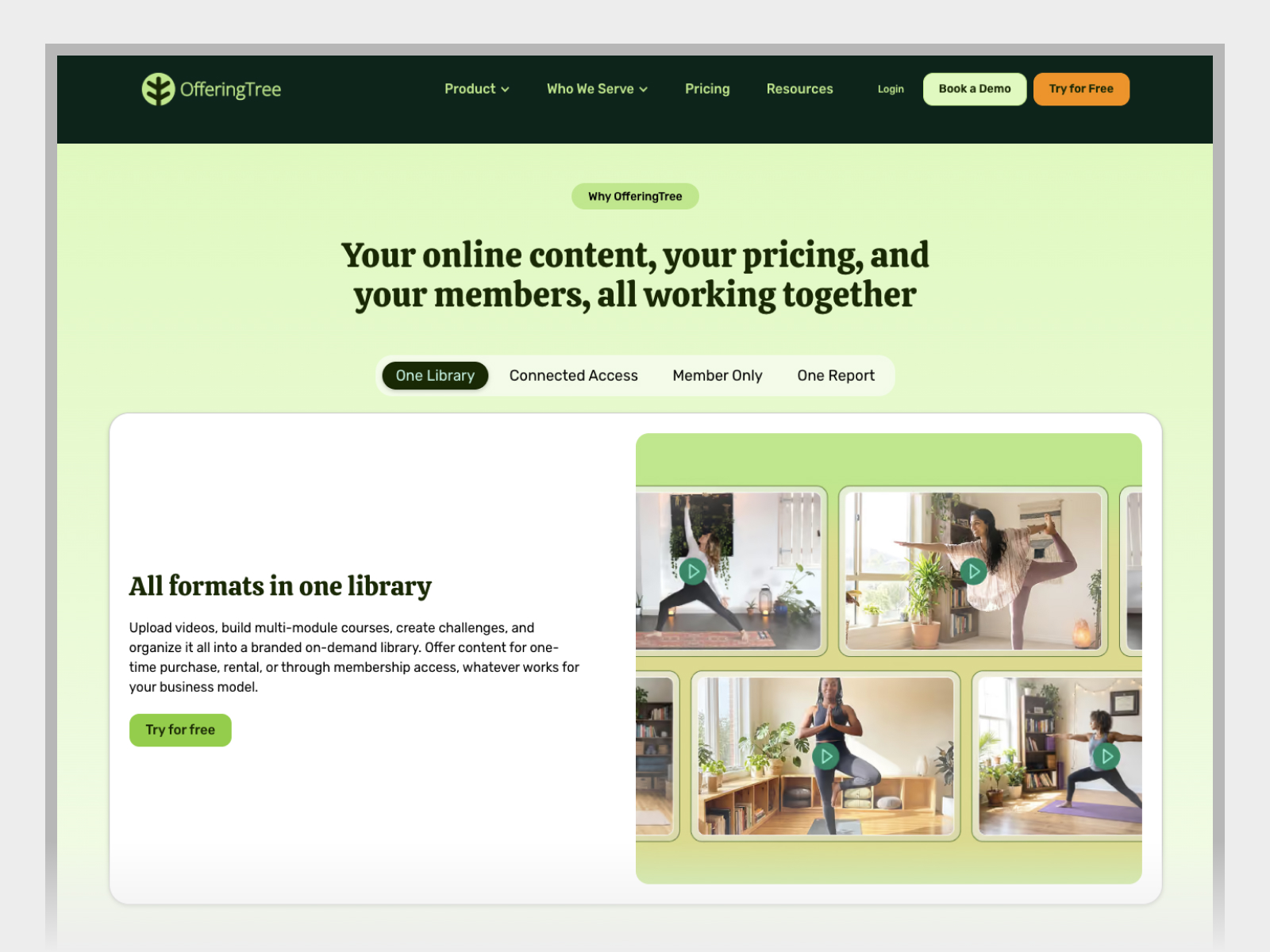
We designed the pages in Figma and built them in Webflow in partnership with OfferingTree. Claude and Codex helped us carry the designs into the build. The work still happened in close conversation with the team. We could look at a page together, decide where a product image should sit on a phone, and review the change in the working site. A section with a customer video raised a different set of questions. How should it open? And what should that same layout do on a page where there’s no video?
The answers became part of the site's design and functionality. We built reusable layouts for things like resources and partner pages, so the team could add a new partner through Webflow’s content editor and have the page use the structure already in place. We also worked through the details that come with replacing a whole site, including existing content, redirects, mobile navigation, and how images rendered once they were in the browser.


We built an interactive brand guide in Node.js for the decisions the team would need to refer to again. If someone needs a logo, they can grab an SVG or PNG. If they’re making a graphic, they can copy a color value and check that the type will be readable against it. The guide puts those everyday tasks alongside finished examples and links back to Figma, so there’s a way to see how the same decisions work in a real design.
OfferingTree relaunched its full marketing site with a refreshed identity, new page designs, and a library of product graphics built around the work of running a studio. The partnership continued after launch as we refined the imagery and brought the brand into marketplace graphics, ads, and email.
The part I like about this project is how far we got to follow the same decisions. We could work out how the brand should feel on an early page design, carry that into Webflow with the client, then give the team a guide they could open the next time they needed to make something themselves.