BrandZap
George Little
Case Study
Client
Archevia
BrandZap’s role
Website strategy, creative direction & Webflow development
Brand identity
Casey Walsh, Candlefly Studio
Platform
Webflow, Figma, Figma MCP, Claude Code
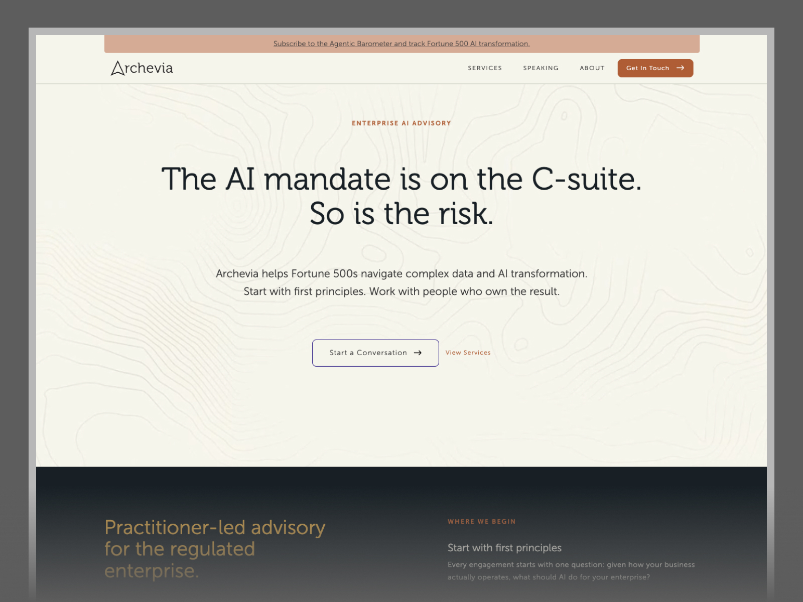
Archevia is an advisory firm that helps leadership teams in regulated industries work through what to do with AI and how to put a strategy into practice. Its founder, Zar Toolan, had done that work from inside large financial institutions. The website had to explain the new firm and make that operating experience easy to see.
One of the decisions that shaped Archevia’s website came down to what happened when someone clicked Services. In an early layout, four practices got roughly the same amount of space. In another, the main advisory engagement came first, and benchmarking and executive education had clear places of their own. Both layouts could tell you what Archevia did. They gave you very different ideas about where to start.
BrandZap joined Zar and his team as a creative direction partner and Webflow developer. We helped work out what the site needed, planned how the pages would fit together, and carried those decisions through the build. Casey Walsh of Candlefly Studio designed Archevia’s brand identity. We worked with Casey to bring that identity into the site.

Think about two people who might get sent the same Archevia link. An executive who’s been asked to lead an AI initiative may want to see what an advisory engagement involves. Someone planning a board session or conference is trying to see what Zar could bring to the room. Both need enough context to trust the person they’re considering working with, and each has a different question they want answered first.
There was plenty of material to work with. We could tell the story of Zar’s career, walk through the advisory method, explain the services, and give visitors a way into his writing and speaking. The question was how much of that the first site needed and where the detail belonged. A page makes sense when it gives somebody a useful answer. It also gives them another choice to make on the way there.
We started by looking at websites of comparable advisory firms and expert-led businesses. We compared how they introduced the work, how much detail they put in the navigation, and where they made space for a founder’s experience. We also looked at what happened after you found an offering. Could you get a sense of how the firm worked? Was there a clear way to get in touch? The comparisons gave us a common reference for talking about Archevia’s site with Zar.
Then we drew a couple of ways the site could fit together. A site map shows which pages exist and how someone can get from one to another. For Archevia, it helped us see what a visitor could learn on the homepage, when it was useful to go deeper on Services or About, and where speaking needed its own route. We could talk about a specific visit and see how many steps it took before that person got the answer they came for.
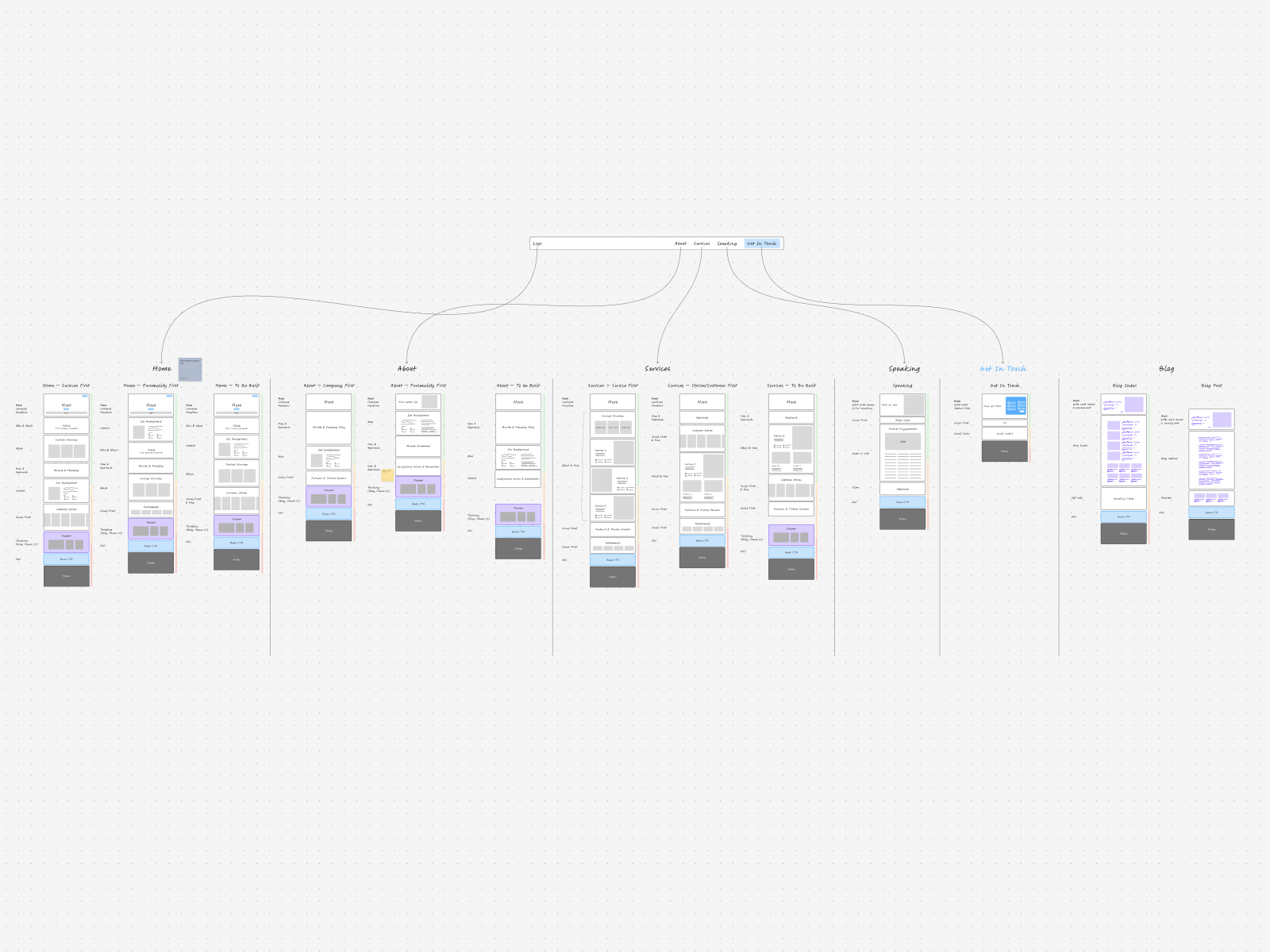

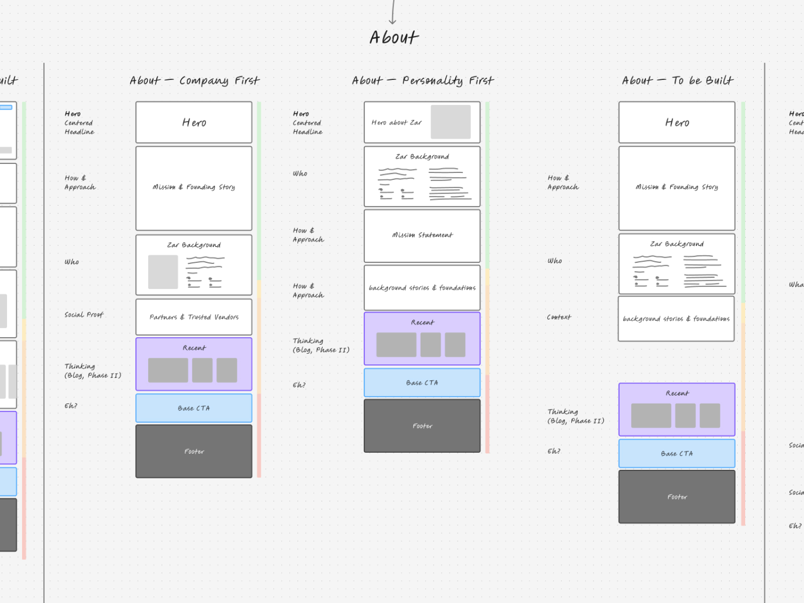
We took those decisions into rough Figma layouts while Casey was developing the identity. We could look at the order of the page before getting into color or type. One homepage gave more space to Zar’s experience and speaking. Another brought the firm’s approach up under the opening and made the services easier to find. In the review, Zar picked the company-first route. He wanted people to understand what Archevia did and how it worked before the homepage took them further into his story.
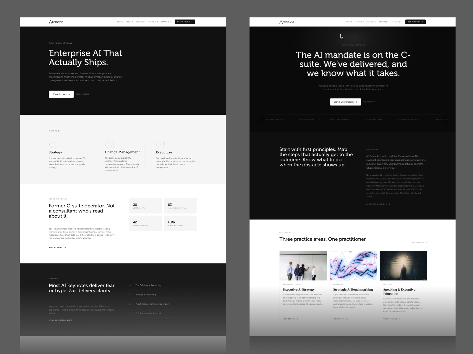
We made the same comparison on Services. Giving the main advisory engagement the lead gave visitors a place to start. Benchmarking and speaking could still be easy to find. We could give the homepage, Services, and Speaking a clear job each, with a place for Zar’s story on About. For resources, we planned sections that could be reused as the site grew. That gave us room for more material without making every new topic a page we had to finish for launch.


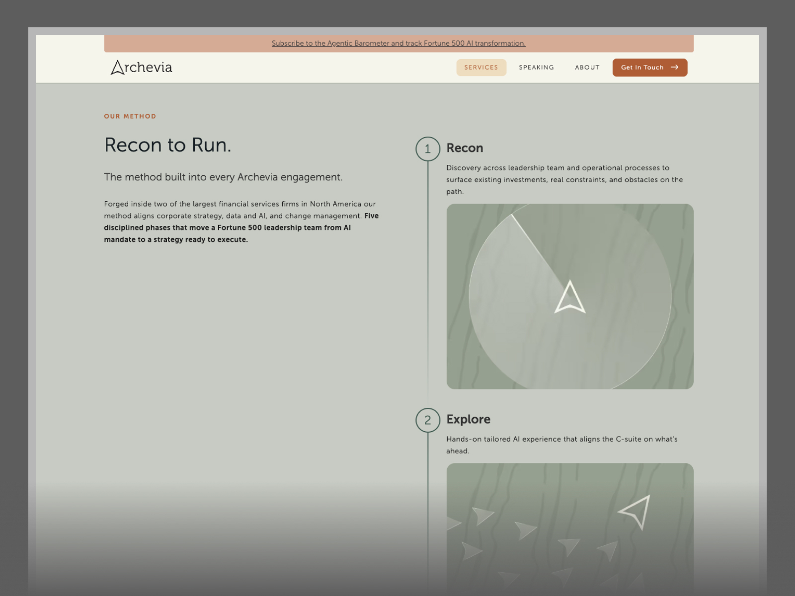
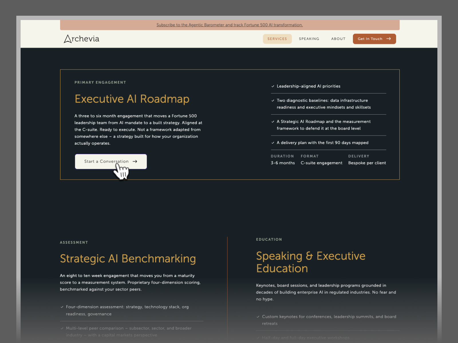
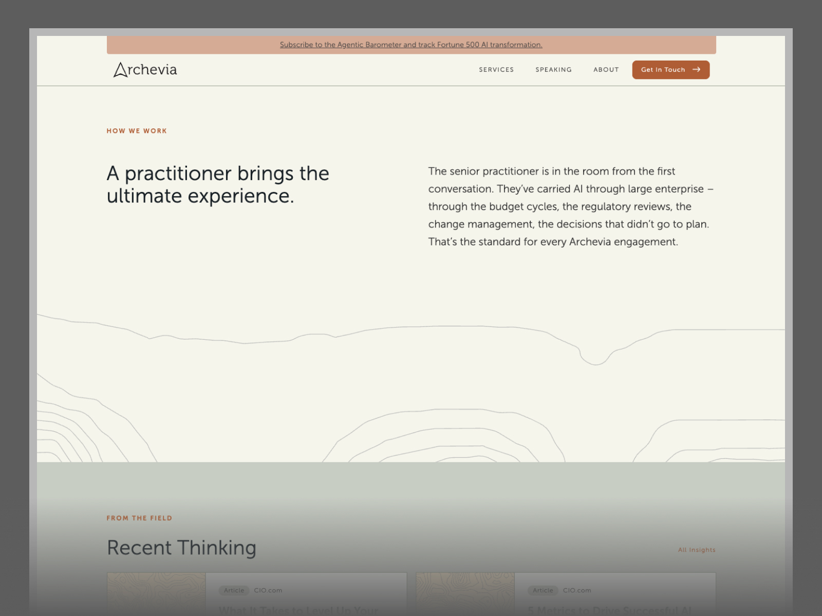
Casey’s identity gave us a set of decisions to work from, including the type, colors, and graphic assets. In Webflow, we set up shared styles for those choices. Changing a color or a type setting in one place could carry across the sections that used it. A big headline could give the opening of a page some presence. An engagement description had more to read and needed a different balance. Working through those instances with Casey and the Archevia team helped the pages feel related even when they had different jobs.
Photography gave us one of the more useful conversations. We looked at a stronger color wash, black and white, and a quieter treatment that left some of the color in. Casey suggested trying the options on the About portraits, where a treatment that worked on a landscape might feel different on someone’s face. We had a softer version on Zar’s portrait already, so we could compare the options on the kind of image the site would actually use.
We used AI-assisted design and development to move more quickly between an idea, a layout, and a version we could review in Webflow. That let us spend the review time on questions we could actually answer in the browser. Does the next step make sense after you’ve read about the service? Does the section still work when the columns stack on a phone? As we got closer to launch, we worked through the navigation, page layouts, and contact experience as parts of the same site.
One of those browser details came up on the homepage. Someone browsing Zar’s work might want to listen to a podcast right now or save a white paper for later. We moved the type label above the title and gave each media type its own color in Webflow. Once the team labels an item in the content editor, the card can show that distinction wherever it appears.
Archevia launched a public Webflow site with a clear introduction to the firm and room to go deeper. The homepage shows the range of the work, the Services page explains how an engagement unfolds, and Speaking gives organizers a place to see formats and topics. Visitors can also get to know Zar’s background and find a way to start a conversation.
The part I like about this project is that we got to follow the same decisions all the way through. We could sit with Zar and Casey and work out what a page needed to do, then build it and see whether it did that job. The site map gave us a way to decide what was worth building. The Webflow build gave those decisions somewhere to live.